Exercise 2: Social Change
Now it is time to expand your investigation. In a New York Times review of Putnam’s book, Margaret Talbot wrote, “Within months, the ‘Bowling Alone’ thesis had generated an enormous amount of attention, and almost as much agreement. . . . Before long, though, a backlash set in, and Putnam’s data began to take a beating, especially from other social scientists and pollsters.”
- Is community really declining in America?
This exercise will introduce you to the critique of Putnam’s argument about social change in America and teach you how to produce and interpret line charts and how to recode variables in SDA.
A. Reading
- (Re)Read Bowling Alone, Chapters 1-3
- Read the reviews of Bowling Alone in The New York Times and The American Prospect
- Questions 1-3
B. Producing and Interpreting Line Charts and Recoding Variables
Questions
- According to Margaret Talbot in The New York Times review, what was the major criticism of the “Bowling Alone” thesis? Do you think Putnam addresses this criticism in his book? Why or why not?
- In The American Prospect review, what is Gary Wills’ major objection to Putnam’s thesis?
- What is the difference between intracohort and intercohort change, and why is it important for Putnam’s thesis?
- Interpret the results of one leisure activity on the line graph from figure 22 on page 105 of Bowling Alone and compare your results with figure 22.
- Looking at your results, what are the percentages for 1975 and 1998, respectively? During what years did the sharpest declines (report percentage changes) take place?
Instructions and tutorials associated with this exercise
Online analysis software facilitates speedy investigative analysis in very large datasets. The DDB and GSS are large because they are the combined data from surveys that were conducted over many years (and are still continuing).
In the second section of Bowling Alone, Putnam investigates social change, specifically the “Trends in Civic Engagement and Social Capital.” He uses the DDB and GSS because these surveys have asked questions about individuals’ social behavior over the last half of the twentieth century.
A practical way to investigate and communicate quantitative trends over time is with a line chart that lists time (e.g., days, months, years . . .) horizontally across the bottom of the chart. Putnam uses many line charts to support his thesis that community has declined over time in America. Are you convinced? An example of a line chart is figure 22 on leisure activities on page 105, which you will replicate after you finish this tutorial.
Since you have learned how to run and interpret a frequency on club meeting attendance or “clubmeet” in the DDB in Exercise 1, let’s extend your investigation to producing a line chart in order to examine what has happened to club meeting attendance over time.
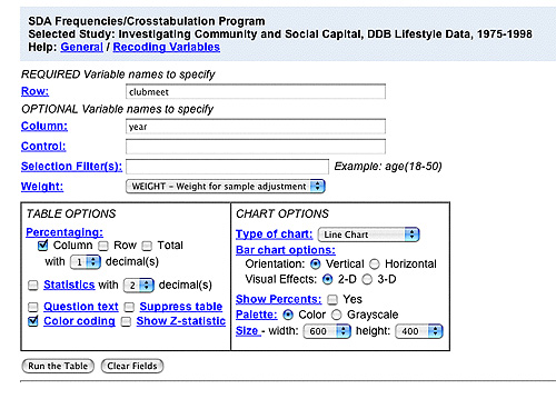
Open the DDB dataset, select “Run frequency or crosstabulation (with charts)” and type “clubmeet” after “Row” and do not forget to type “year” after “Column.” Under “CHART OPTIONS” and “Type of chart,” select “line chart” and “Run the Table” as shown in the image below.
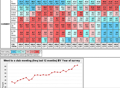
As you can see below, your results will look really messy and, hence, confusing. Why? If you look at the rows in the table located above the line chart, you can see that “clubmeet” is has seven possible codes ranging from “1 = None” to “7 = 52+ times.” Consequently, there is a line on the chart for every one of these codes.
It is possible to simplify this line chart with a procedure called “recoding.” Let’s turn “clubmeet” into a variable that has only two codes:
- 0 = None (Change the old code from ‘1’ into ‘0’ to make more sense.)
- 1 = Went to a club meeting in past twelve months (Change the old codes ‘2 thru 7’ into ‘1’.)
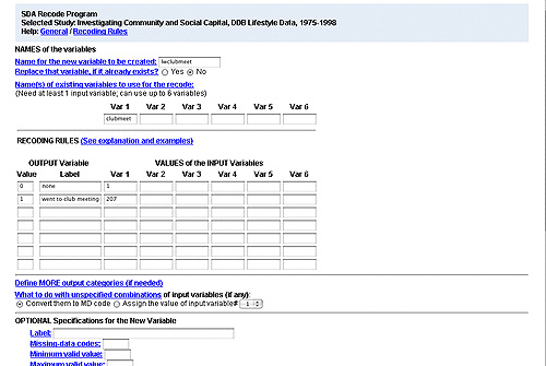
To do this, open the DDB dataset and select “Recode variables.” The window below looks complicated and confusing, but once you get the hang of it, recoding is easy.
Let’s start (see screen below) recoding. The very first thing you should is create a unique name for your recoded variable and type it into the box labeled “Name for the new variable to be created.” You can think of this unique name as something like a “password” for your variable. No one else can choose this name for the variable, and therefore when you came back to work on this program at a later date, that recoded variable will still be accessible to you (hence it is important that you DO NOT “replace” anyone else’s variables if the name you choose is already taken by another SDA user on the Web). A good suggestion for choosing a unique name is to insert your initials before or after the old variable name.
Next, under the section “Name(s) of existing variables to use for the recode,” type “clubmeet” in the “Var 1” box. Immediately below this, under “RECODING RULES,” note the first column, labeled “Value” under “OUTPUT Variable.” The new values for your recoded variable, ‘0’ and ‘1’, go there, with the labels next to them. Do not skip putting in labels, since this will avoid confusion later. Finally, in the third column, under “Var 1” type in the old codes for the variable as shown in the image below. (If you were recoding numerous variables into ‘0’ and ‘1’, you could put additional old codes under “Var 2,” “Var 3,” and so on.)
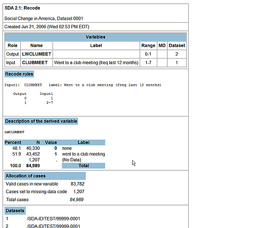
Finally, scroll down a bit and select the “Start Recoding” button. The following screen will appear so you can double-check your recoding. Note percentages, values, and labels. Does everything look right?
If your new recoded variable looks correct, you are ready to make your cleaner, simpler line chart with your new recoded variable. Open the DDB data, return to the instructions for the line chart above, but instead of entering “clubmeet” into the row, enter in your unique variable name. Your results should look like this:
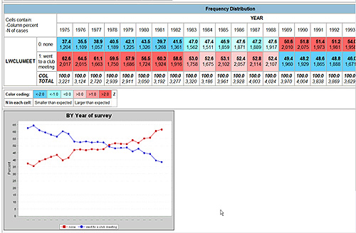
Let’s interpret these results.
First, the blue line represents the frequency of individuals who went to a club meeting from 1975 to 1998. What happened? Look in the frequency distribution table for the exact percentages within each year. In the decade between 1975 and 1985, meeting attendance dropped almost 10 percent. Between 1988 and 1998, it dropped 14 percent. If you would like to take a closer look, rerun your line chart type “year(1975-1985)” next to “Selection Filter(s).” Now run another with “year(1988-1998).”
By the way, in the screen results above, the red line represents the frequency of individuals who did not attend a club meeting. What does the red line reveal? The blue and red lines are simply mirror images of each other. Consequently, for a table published in a book, article, or report, the red line would most likely be removed from the chart. You could do this with fancier graphics programs. However, SDA is a quick and powerful way to see what is happening to civic engagement over the many years of the DDB surveys. You can do the same with variables in the GSS surveys. Return to the remainder of Exercise 2, so you can practice your new skills with line charts and recoding.