WordPress How To
Site-specific Information
Please log in to your specific project site by navigating to https://wpvip.icpsr.umich.edu/wp-admin/ and selecting the relevant project site from the My Sites dropdown button (top-left). Multiple editors or contributors may have access to each project site; if you have any questions about site or section content, please reach out to the project’s staff before making any changes.
Most project site owners and editors should also have access to the shared site, which is where News, Events, and Generic Post content is published so that it can be used across any or all of ICPSR’s project sites while being maintained in only one location to ensure consistency and accuracy. Please review shared site policies before adding content.
A note about URL patterns
Each archive/project site has a URL that starts “www.icpsr.umich.edu/sites/” — e.g., …/sites/icpsr or …/sites/pcodr
For direct URLs to resources in the shared project…
- the pattern for News is …/sites/{project}/news/{slug}
- the pattern for Events is …/sites/{project}/events/{slug}
- the pattern for Generic Posts is …/sites/{project}/posts/shared/{slug}
Other Resources
Please review the Accessibility for Content Creators document to make sure the content you are adding is compliant and the ICPSR Editorial Style Guide to familiarize yourself with ICPSR’s internal guidelines and brand standards. See also: Policy on Content Posting by External Editors.
The Slack channel for ICPSR WordPress Users can be a good place to share tips and tricks for achieving a desired layout or otherwise optimizing page content. Please also use this channel to suggest design improvements, new features/functionality, or other change requests; once you’ve received feedback on your suggestion, you can submit the request to [email protected]. Requests will be reviewed and prioritized during planning sprints every 8 weeks.
Editors can also consult the Mosaic Design System documentation, which provides information about and examples of front-end components and variants designed for the overall ICPSR platform (although note that not all are currently available in the WP flexible template).
To request content changes to the ICPSR website, please see M&C’s request and review process.
General WordPress Instructions
First and foremost, do not leave any edit screen open for too long or you will lose content when WordPress eventually signs you out. Learn more about getting started in WordPress in the accordion below; click on images to make them larger.
Send an email request for WordPress access to [email protected]. Please let us know what site you’re looking for access to (example: NaNDA, ICPSR, shared site, CGHE, etc.)
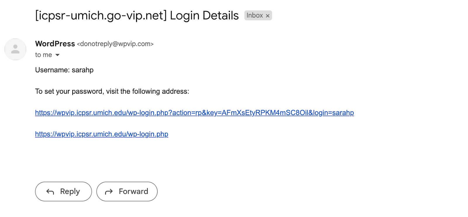
Upon being granted access to WordPress, you will receive an email notification resembling the example depicted below. Notably, the username will be personalized to your account, rather than ‘sarahp’. To initialize your password, please click on the first link within the email.
—
Note that discussions re: updates to org policies related to access and content editing are in progress among leadership.
Q for UXE – any recommendations for the add’l AuthN options?
Add info here re –
Administrator
Editor
Author
Contributor
Subscriber
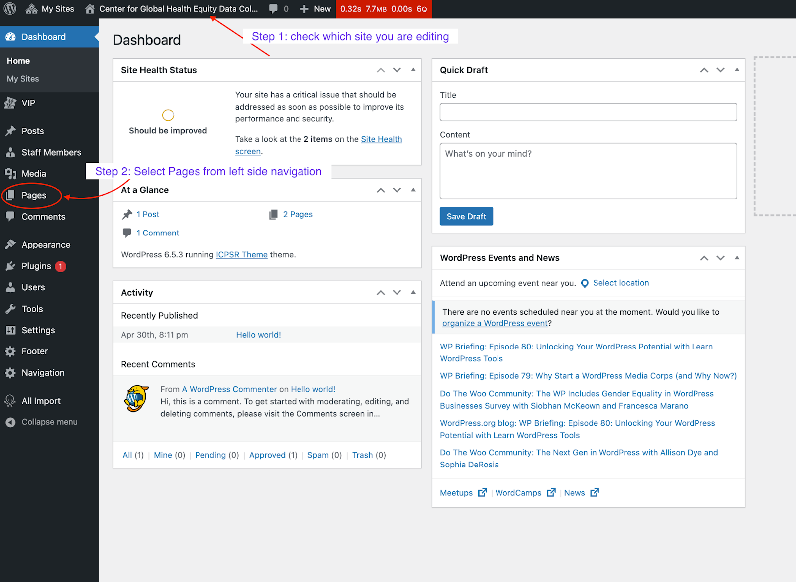
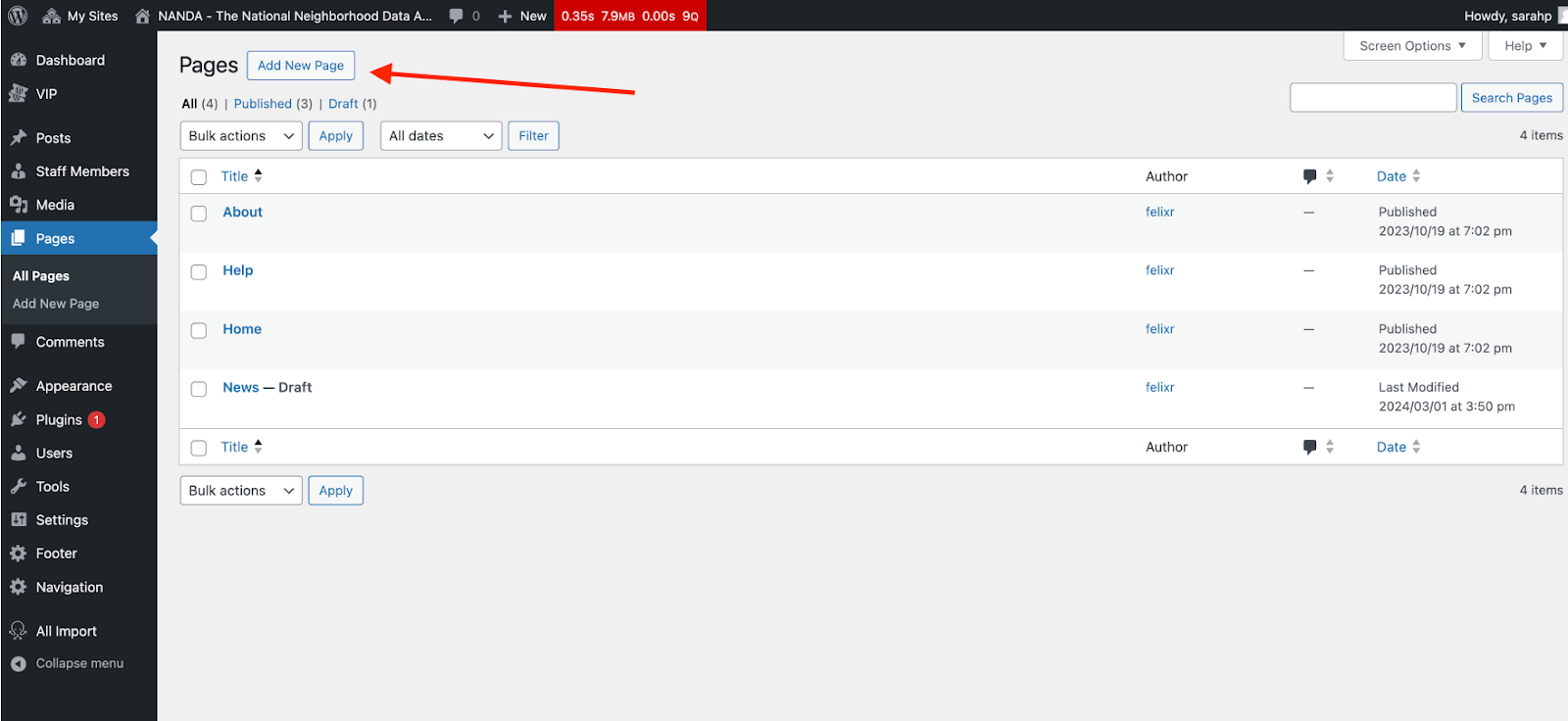
Once logged in to the desired site, from the left-side navigation, click on Pages. This action will redirect you to a new page that enumerates all pages associated with the site in question. On this page, select the Add New Page button (at the top next to the “Pages” heading) or choose which site page you wish to modify from the list.
Select a page template & parent page
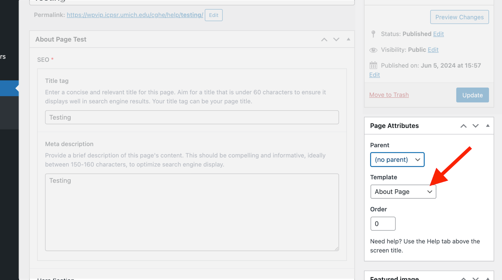 Once on your new page, before you do anything else, find the Page Attributes section on the right-side of the screen and select your template from the dropdown. Currently, you can select the Flexible Content and Flexible Content 2 templates. While the Flexible Content template still works we strongly suggest you use the Flexible Content 2. This is the only template that will be updated with new components. It has (as the name suggests) much more layout flexibility. It allows editors to add many layout components (e.g., multi-column layout, table, accordion, cards, feeds from the shared site, and more) in any order of their choosing, and components are being continuously added to and updated in the flexible template.
The page Parent field is also located in the Page Attributes section. This will determine the section URL patterns and should be what drives your site’s content organization. In the example below, note that About is the parent page/Careers is a nested child page, and also note the nested URL structure in the Permalink (aka Slug) field.
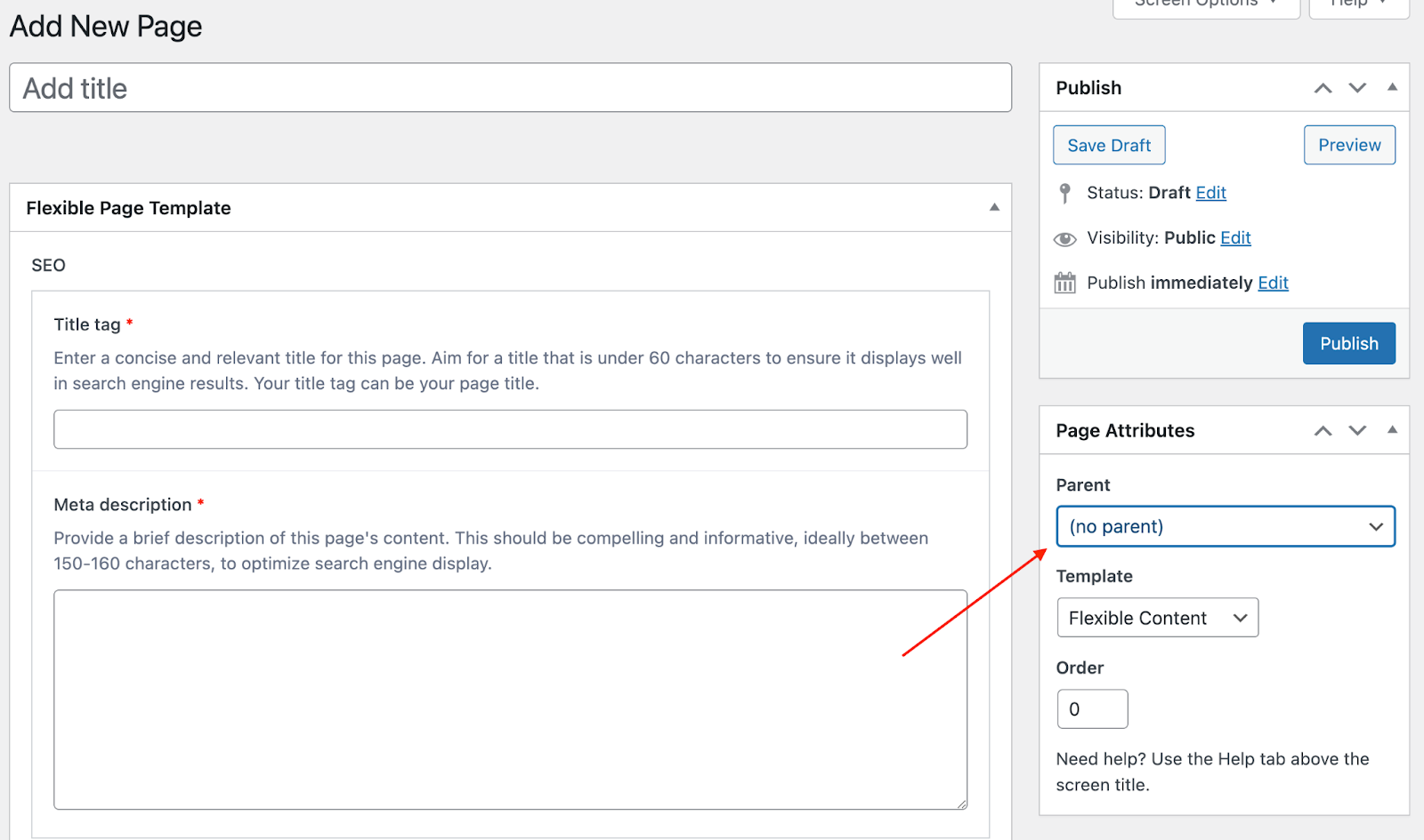
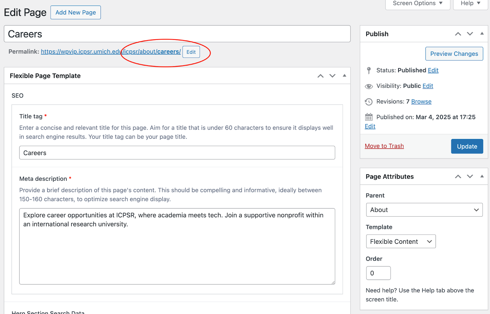
It’s best practice for pages you want in the top navigation to have “(no parent)” selected and to then nest subnavigation pages under the relevant parent page. You must create a parent page before you’ll be able to nest any children pages. However, the top navigation itself will NOT automatically update based on the nested page list; to request changes, please submit a ticket to [email protected] (and also see next accordion item).
Fill in page metadata
Title is the field you will use to help you find the page in the WordPress list. It is also the default URL for your page unless you choose to change it.
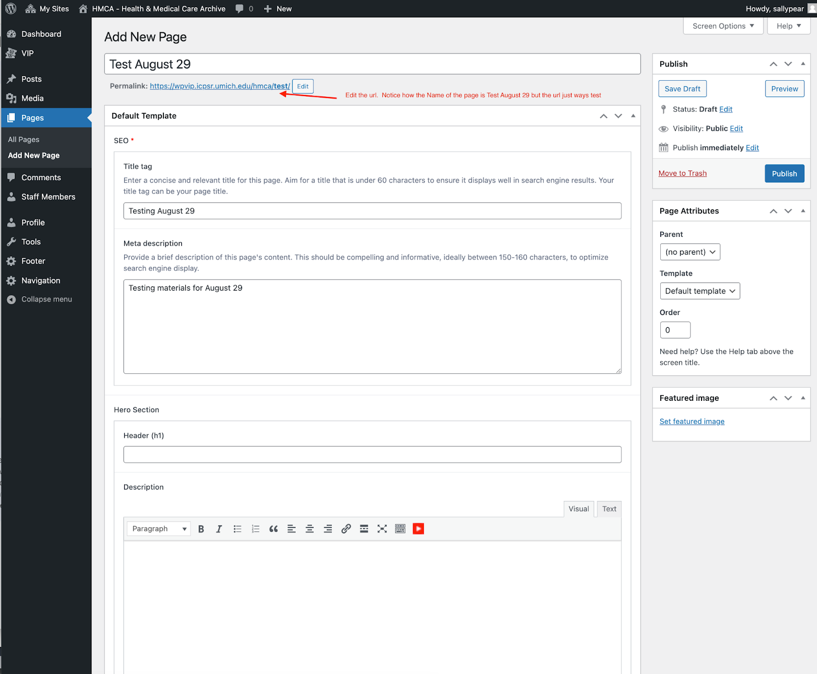 Permalink (aka Slug) is the field with which you can change the page URL. We recommend optimizing URLs for improved accessibility by keeping them relatively short. Please note that if you click on the permalink itself, it will not take you to the actual page. Instead, it will take you to a virtually blank page; from there, you can change the “wpvip” in the URL to the appropriate production URL pattern to view the page.
Meta description is an HTML element that provides a brief summary of a web page. A page’s meta description tag is displayed as part of the search snippet in a search engine results page and is meant to give the user an idea of the content that exists within the page and how it relates to their search query. There is a 160 character limit (including spaces) for this field.
When the Administrator Only field is set to true, only site admins will be able to edit this page. This is necessary for pages with embedded forms or search boxes so that these components don’t break the page upon publishing updates.
Select top level page component
First, select either Hero or Home Page Splash from the dropdown. Then, input a Heading that will serve as both the H1 Heading on the page AND the Title Tag that appears in the web browser tab at the top. Any text entered in the Description field will appear under the Heading on the page (as plain text only if you selected Home Page Splash).
- Note that a Title Tag is an HTML element that specifies the title of a web page. It’s one of the first things search engines look at when determining what your page is about, making it a critical component of on-page search engine optimization (SEO). The title tag appears in three primary places: the browser tab to help users identify and navigate between open tabs, search engine results pages (SERPs) (when someone conducts a search, the title tag appears as the clickable headline in the search results), and social media shares as the title of the shared link.
If you selected the Hero component, the Heading & Description fields will appear in a hero section with a grey background at the top of the page.
Show Search Field or Search (depending on which component you choose). If you select to show a search field you are then given the option to choose where you want your search box to take users. You can choose from Studies, Variables and Publications. You can also change the placeholder text, default is just “Search …”. We recommend giving description informative text and not just search publications or search variables. Please note to not select variables or publications if your archive doesn’t contain any. While we have put in some safety checks users could be taken to an empty page.
You can also choose to include featured links, or a featured image in the hero component as well. Example hero section with description and featured image:

If you selected the Home Page Splash component, you have the option of adding a background image to the hero section behind a box containing the Heading and Description fields. If you do not add an image, the background will be gray (but, in contrast to the Hero component, the box for the Heading and Description fields will remain).
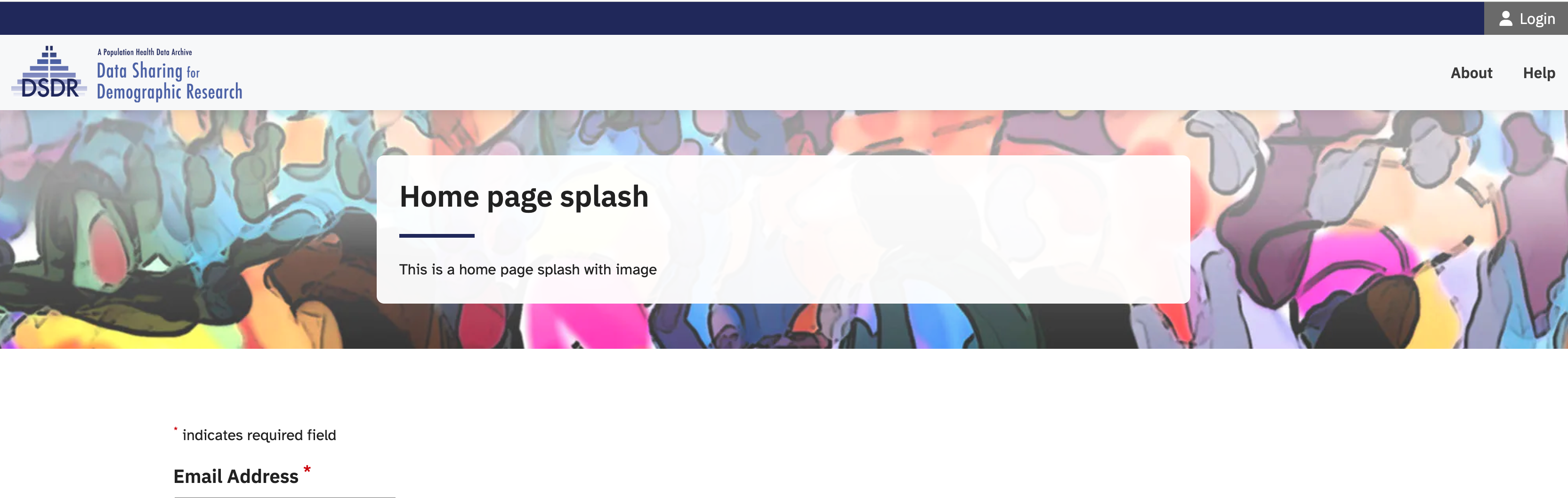
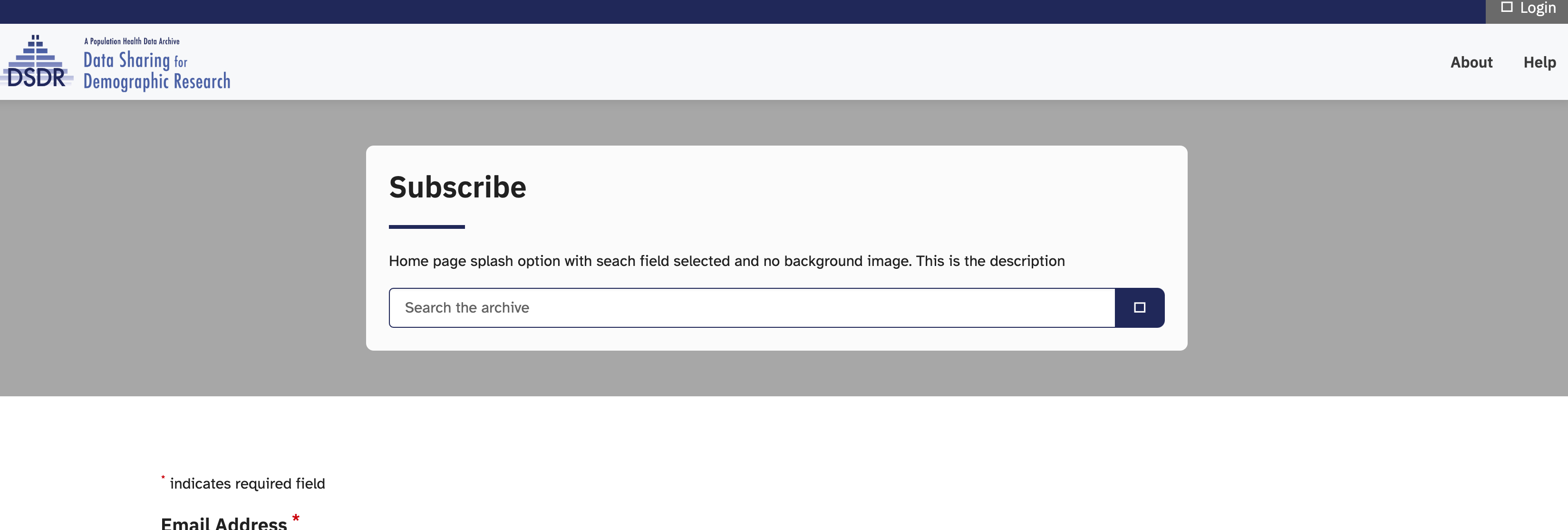
If your image is too large, you can scale it down in size, but we recommend you do not use images less than 1500px wide. For an idea of what will appear on the screen, see below for an example of how the image looked upon uploading it compared to how it appears on the website. Note that the CSS is set up to have the image centered (both vertically and horizontally).


For both background images in the home page splash and featured images in the hero, you may need to experiment with different images and sizes to find one suitable for the page and content.
Save and publish
You must add at least one row of content (learn more about editing content with layout components in the next section) before you can publish your page. Once you are prepared to make your post live, you can locate the ‘Publish’ button on the right-hand side of the page, situated near the top. If you are not ready to make your post live you can save it as a draft or schedule a date when you do want it to be published. These buttons/links are located within the same Publish box.
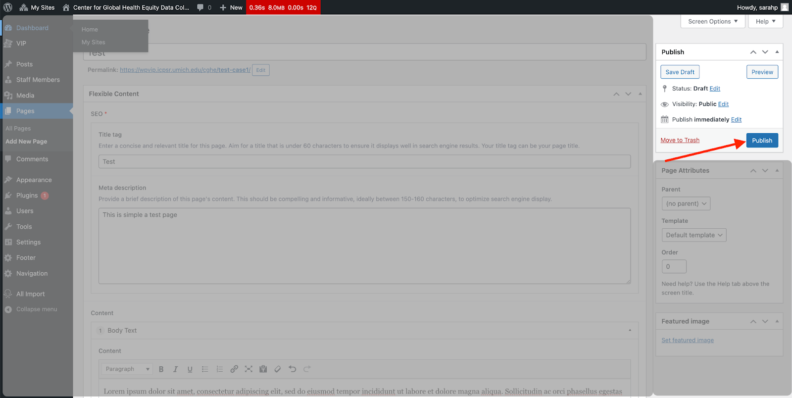

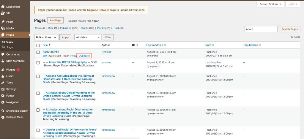
Please note that it is not currently possible to clone or copy a page or create your own page template. This is not a built-in WP feature, and there are possible security concerns related to plug-ins for this purpose. This is not a feature or investigation planned for prioritization in the short-term.
Duplicating a page is helpful if you…
- want to make significant changes to a page without losing the current version.
- want to copy the layout of a page and replace the content.
ICPSR uses page caching to improve site speed and provide a better user experience. Because of this, changes to an existing published page may take up to 6 hours to appear on the live site.
The exact timing depends on when the page was last cached. For example, if the page was cached 2 hours before you published your updates, your changes may appear in about 4 hours.
Note: Brand-new pages are not affected in the same way and should appear live once published.
Previewing Your Changes
To view your updates before they appear on the live site, use the Preview Changes button in the upper-right corner of the Publish box.
Although the preview URL may look like the production URL, your changes may not be live yet.
Sharing a Preview with Someone Else
If someone needs to review your changes before they go live:
- Right-click the Preview Changes button.
- Select Copy Link Address.
- Send the copied link to your reviewer.
The preview link will look similar to this:
https://icpsr.umich.edu/sites/api/preview?secret=icpsreditorpreview&archive=shared&slug=home&type=page
This link allows the reviewer to see the updated page in their browser before the changes are visible on the live site.
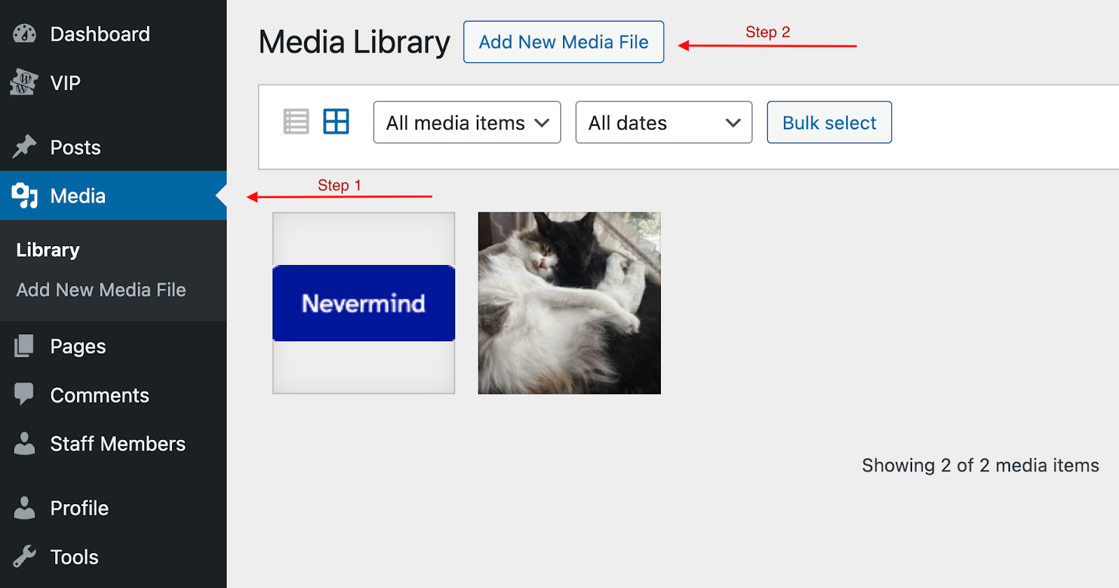
Much of the time, you will likely add images or other files to a page directly from the edit screen using the Add Media button or as part of other page-specific layout components described in more detail in the next section; however, editors can also manage their site’s media (e.g., add, edit, organize, or delete files) from the Media section on the left-side navigation. It’s good practice to periodically review your media library to remove duplicates or other files that are no longer in use.
Uploading Files
To add media directly from this section, select Add New Media File and either drag and drop or select your desired files. Your file will appear with other site media items. Note that files over 2GB will not upload to the site.
Editing Images
WordPress allows you to edit images directly, either in the site media section or the page’s edit screen. You can also edit images outside of WP before uploading if you’re more familiar with other editing software. Accepted image file formats include .png, .jpeg, .jpg, .webp, .svg, and .pdf.
Click on an image in the media library to open the edit screen, where you can also add alternative text to the image. If “Title” has been filled in by the image’s metadata, please delete it. This field usually defaults to the file name and should either be left blank or changed to something more descriptive/understandable to an end user.
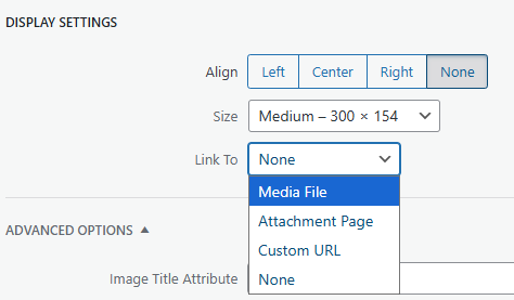 Clicking on Edit (pencil icon) from the WYSIWYG will open up options for Alt Text, adding a caption, display settings, and other options. Within the Display Settings section, you can resize the image directly and/or choose to Link To to either the Media File itself (which will open up a larger version of the image, as on this page) or to another link of your choosing (Custom URL in the dropdown) when a user clicks on the image.
Click on the Edit Image button for options for cropping, scaling, and rotating an image. (Troubleshooting: if you get an empty page or pop-up, close that screen and click “Edit Image” again; this seems to be a WP glitch.) Click on the question mark icons for further instructions for editing the image.
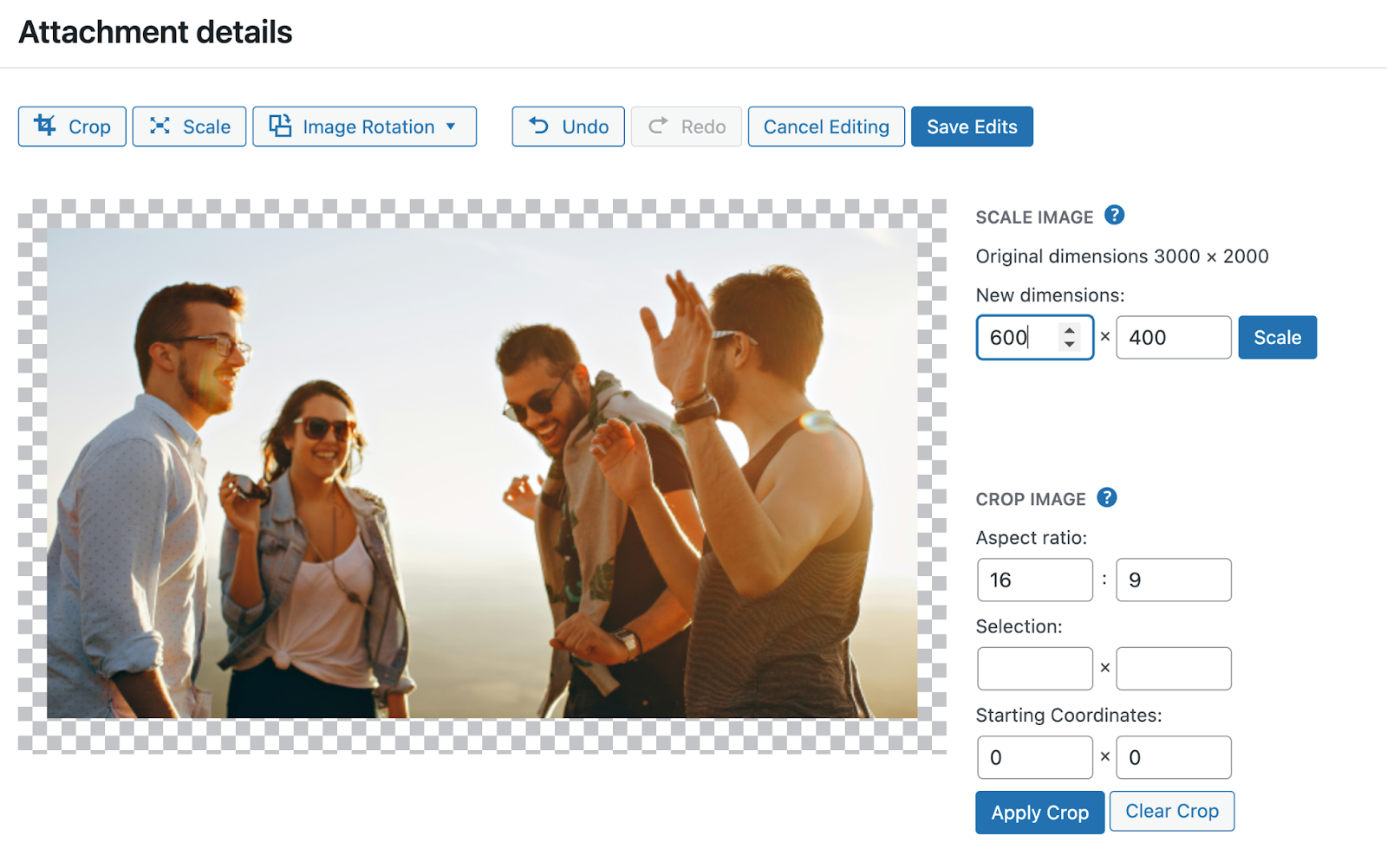
Note that images intended for use with limited or marketing cards must be 600×400. If a card’s image is grayed out, that is because the image is not the correct size. (Find more detail on these card layout options in the next section.)
To crop an image to the correct dimensions, first select Crop and specify a 16:9 aspect ratio, which will allow you to move the visible area around to the part of the image you want to use. Click Apply Crop, then select Scale, and enter 600×400.
If your image is still not the correct size, e.g., if you input ‘400’ but the image size is now ‘692×400’ you will need to grab the resize square and move it until the image is 600×400.

Icons can be added to any field that uses a Text editor for entering content.
Start by selecting an icon from FontAwesome’s website. Only Font Awesome icons should be used on our websites. When you click on an icon, a modal will appear with various options for using the icon. 
Select the “SVG” tab and then click on “Full SVG”. Copy the code (you can do so simply by clicking on the code).
In the WordPress editor, make sure you are in the Text editor mode. Icons cannot be added in the Visual text entry mode.
Paste the code you copied wherever you want the icon to appear.
The last step is to add a class="icon-inline" to the svg element of the code you just pasted. An example can be seen in the examples section of the Mosaic Icons documentation.
If you need any assistance getting icons to work, please submit a ticket to [email protected].
At the bottom of the screen, past the Flexible Content section, you’ll notice a box/section called Searchable Text (auto-generated), which, as the name suggests, autogenerates information for SEO by creating a copy of all text entered in the Flexible Page Content section to make it available for the search index for this page. This information does NOT include content that is dynamically generated, such as through a feed component.
This is especially relevant to pages that include the Staff Section component because the staff content is being pulled from the Staff Members section (not indexed by search), and not from the page. This means that if a user searches for staff info, this page will not appear in the list of results.
If you want the content from a dynamically generated component (like the Staff Section component) to be available for SEO—for this page to appear in the results when a user searches for staff—you must copy the text you have configured to display on the page (e.g., names, titles, bios) into the Additional Search Text field. Content entered here will not appear on the page itself (other than via the configured Staff Section component); this field is what makes that content available to search engines for the specific page.
Although News, Events, and Generic Post feeds are also dynamically generated content, these post types live in the shared project site and are thus indexed separately for site search (in ways that the site-specific Staff Members section is not). You currently only need to use the Additional Search Text field on pages using the Staff Section component. This document will be updated when/if there are any planned changes to site search behavior or the ways in which various content is indexed for SEO.
Site-wide navigation and footer settings are currently only editable for UXEs and WordPress admins.
To request changes to the navigation or footer, please submit a ticket to [email protected] and include as much information as possible (e.g., about the desired navigation organization, including which text should visible, which page it should point to, if you’d like there to be a dropdown, etc.).
Note that pages added to your site will not be linked in the top navigation unless you submit an IT request.
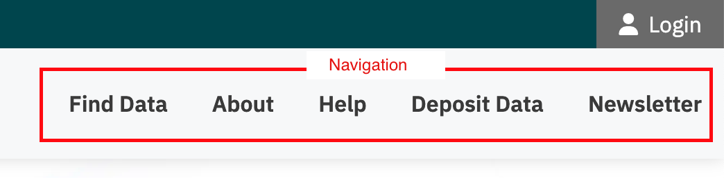
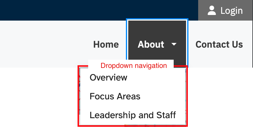
If you’re having trouble finding any screen element/section referenced in these instructions, check your screen display configurations under Screen Options on the very top right of an edit screen (e.g., a page edit screen in your project site or the category edit screen in the shared site) or a list screen (lists of posts, pages, staff members, etc.). This is where you can check to make sure sections like “Page Attributes” or “Searchable Text” are visible on a page edit screen in your project site; or, set the number of viewable list items for the list of Event categories in the shared site or the list of pages in your project site.
A useful feature of the WP content editing interface is the ability to duplicate rows of content. For components that allow adding additional rows such as Accordion items or Table rows, you can duplicate the content by holding the shift key while you hover over the Add row button. You should see the “Add Row” icon button change to a “Duplicate Row” icon button. When you click “Duplicate Row” WP will duplicate the content of that row into a new row. This feature may be useful if you have content or formatting you want to replicate repeatedly.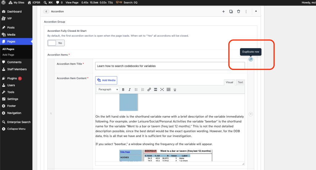
Flexible Content Template Components
Please use Flexible Content V2 for new content when selecting a template. Moving forward Flexible Content V2 will be the only flexible content template receiving new components/features. There is no requirement to migrate existing content from the original Flexible Content template to the V2 template. The original Flexible Content template will continue to be available but will not receive updates or new components/features.
This section provides information about the many different page components available that you can mix-and-match in the flexible content template to create your desired page layout. To get started, from any page’s edit screen, scroll down to the “Flexible Content” section (right below the “Select top level page component” section), click the Add Row button, and select one of the components described below. In the accordion below, click on an image to make it larger.
If you notice spacing or other design issues in between layout components, please email [email protected] so the UXE team can make a holistic fix rather than trying to hack a certain layout for a specific page. Do not add custom HTML to pages because it can compromise accessibility, disrupt the design system, or even break parts of the page when code/technologies evolve.
The Page Content component is a “What You See Is What You Get” (WYSIWYG) editor, a software tool that allows users to create and edit content visually such that the appearance of the content on the screen will closely resemble the final output. Editors do not need to have a deep understanding of coding or markup languages because the editor will handle the underlying code. The easiest way to start adding content is to start typing into a WYSIWYG!
Editors can also add images and other files to a page by selecting the Add Media button at the top left of the WYSIWYG. From here, you can either select an existing file or upload a new file. Images can be edited prior to upload, from the Media Library on the left-side navigation, or directly within a WYSIWYG on a page’s edit screen. (Also see more about managing site media in the previous section.)
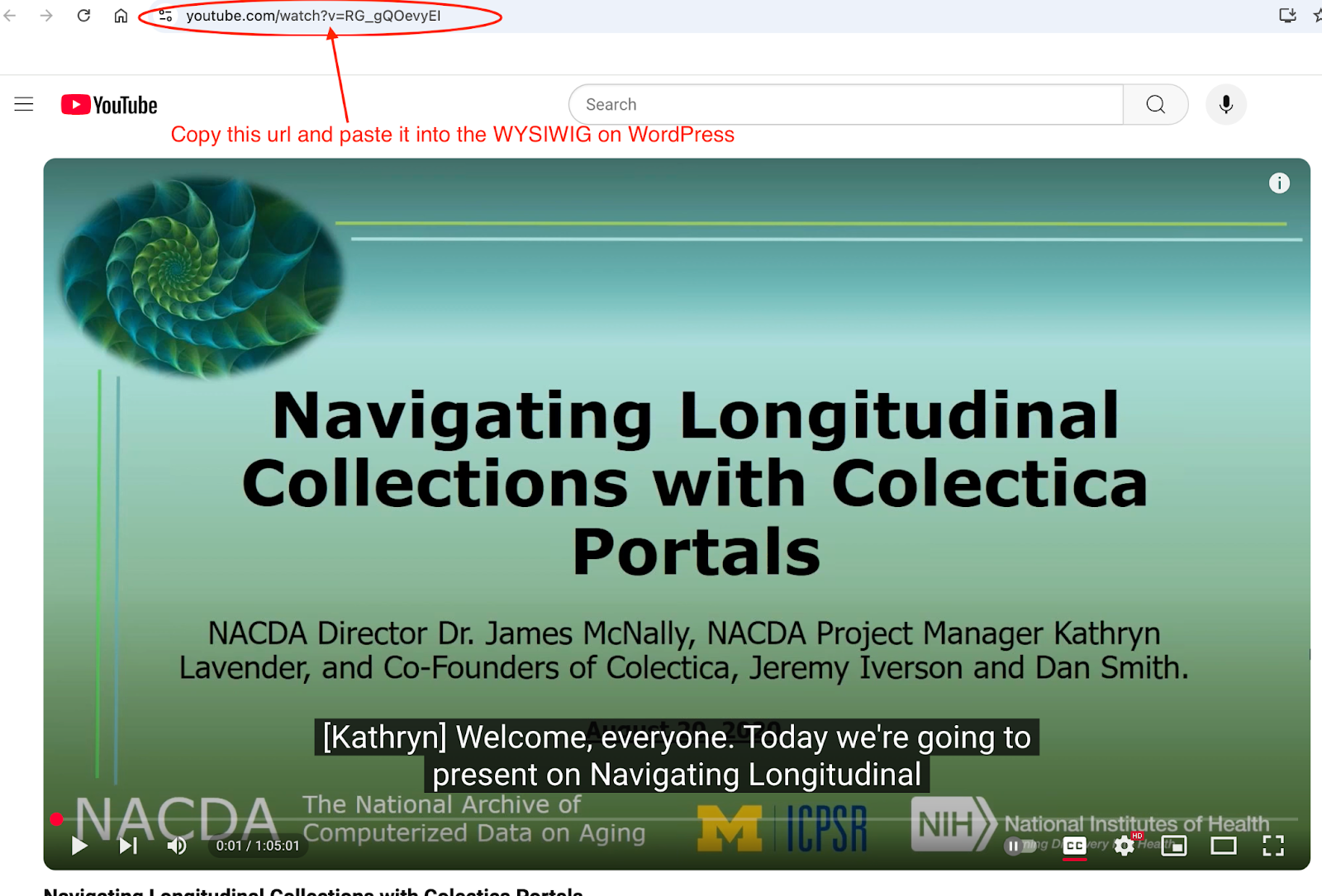
For videos, simply paste the YouTube URL (e.g., https://www.youtube.com/watch?v=RG_gQOevyEI) into the WYSIWYG for it to appear on the page.
To embed Facebook posts within the WYSIWYG you must switch to the Text tab which is the upper right corner of the WYSIWYG editor, next to the Visual tab. Please be aware when you jump back to the Visual tab you will not see anything where your iFrame code is. But when you look at your published page it will be there.
If you want to share a document like a pdf or docx, upload the file to the site media library as above, then insert the file URL into a WYSIWYG on a page. The Title field will default to the file name, so make sure you update it to an intuitive name, and add “(pdf)” or “(docx)” to the text so the user knows that a file will download if they click on the link.
Forms can also be embedded within a WYSIWYG (like a signup to an email list via MailChimp); however, this is currently a task that can only be performed by UXEs and WP admins in order to not break other aspects of the page layout. If you’d like to request an embedded form be added to a page, please send a ticket to [email protected].
Accordions are the hide and show component you often see on our help or FAQs pages (including this page!). Default accordion behavior is for the page to load with the first accordion item in a group open with the rest of the items closed. Users will also see “Expand All” and “Close All” options on the page.
Accordion Item Title is what the user will see and click on to open the accordion item to see more content.
Accordion Item Content is where you put the content you want to present to the user.
You can add as many accordion items as you’d like by clicking the Add Row button within the Accordion box. Screenshot provided for clarity click on the image to make it larger.
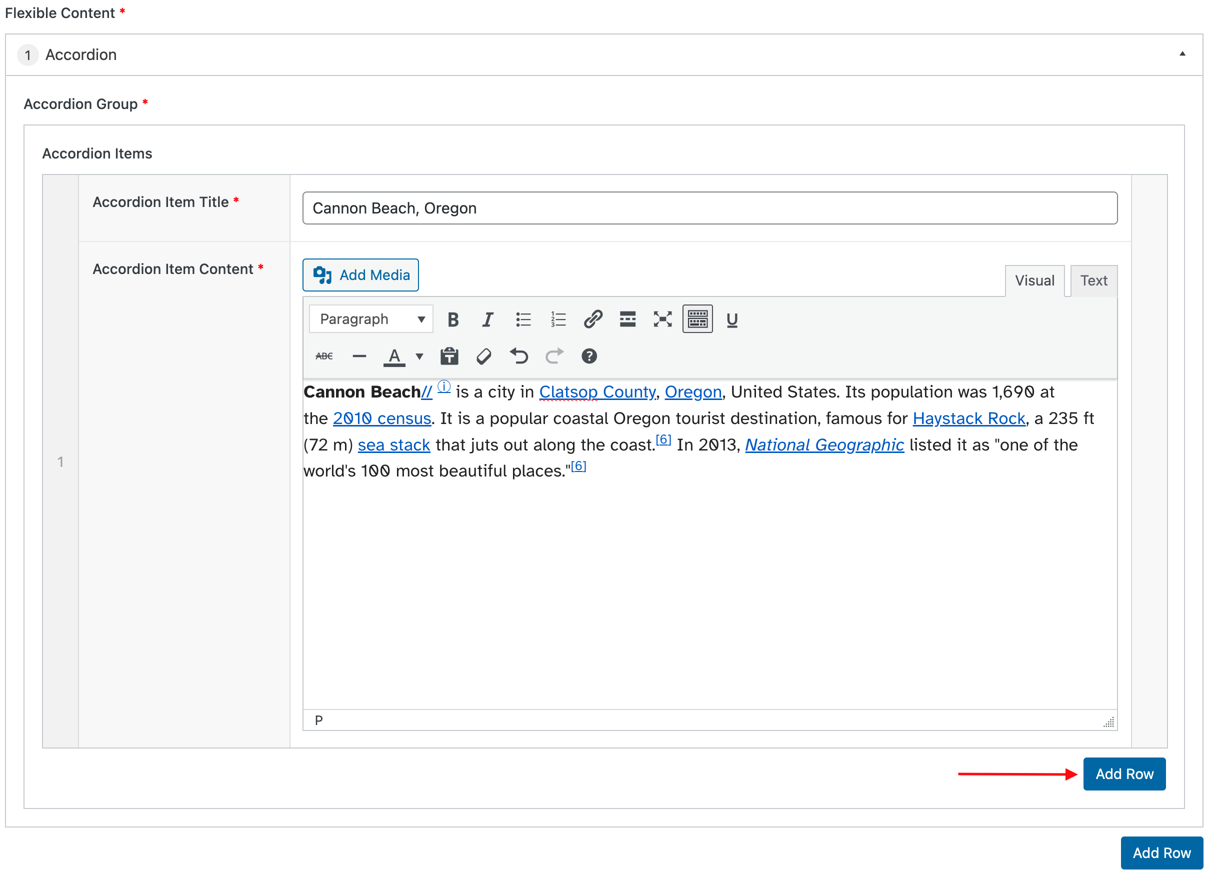
Click and drag accordion items/rows to reorder them, or click on the (+) or (-) buttons to the right of an accordion row to insert or delete accordion items.
This option is to add either one or more buttons in a single row. For each button, you can select whether you’d like the button to look like a link (no color around it), what size and style each button should be (small, medium, large; regular or outline), and how to align each button (left, center, right).

How button alignment works
The default alignment is left and will be aligned to the leftmost side of the layout. If you are using a multi-column layout, the button will be aligned (left, right, or center) within the specific column you are editing. The following example shows a two-column layout (with the left column at 67% width and the right column at 33% width) with a button left-aligned within the right column:

Alternatively, if you want a group of buttons all to be aligned to the right side of the page, create a button links group and make sure that all buttons have “right” selected for the alignment. (Same principle for full groups of buttons to be left- or center-aligned as well.) In this case the buttons will appear one after the other with minimal space in between.


If you have a three button group and choose one each to be left-, center-, and right-aligned, they will display within those layout areas (i.e., with distributed space in between them as compared to the example above).


TO DO – add content re the 3 feed components in flex template after the generic posts feed is live to prod (more info coming late Sept 2025)
The Generic Feed Component is used to display previews of the 3 most recent posts in a user-selected category. If the “Shared” checkbox is selected, then the list of available categories is pulled from the Shared site. If “Shared” is not selected, then the list of available categories is pulled from the current archive site. The “Text” field is used to add a heading and optional descriptive text. The optional “View more button” can be used to link to a category index page.
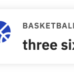
The Highlight Card is similar to the Stats Card in layout and size. This card will have an icon, optional brow and description text. You can add a link which will add a chevron on the right and size of the card. The only things currently required are the icon and Title/Statistic. A screenshot of three different Highlight Cards is below. First card shows icon, brow text, statistic, and description. The second card shows icons, statistic, description, and link chevron. The third card shows the icon and required statistic, it can be either a number or text. More icons are planned to be added soon.

Update to Highlight card on Flexible Template V2 as of March 5, 2026
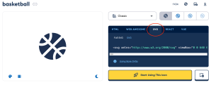
You can now add your own icon to Highlight Cards. This rolled out this morning. Before you could only choose between the book, database and search icon. Now you can add any icon from Font Awesome. You can choose from the Free and Pro Icons. Once you are on the site search for the kind of icon you want, example “basketball” click on the icon you want. From the modal that pops up select the SVG tag from the options in the card on the right (you’ll see HTML, Web Awesome ect) and copy the svg code below. Paste this into the text area in WordPress fill out the rest of the highlight card as normal. Once you publish the page you should see your new icon!
—
Q for UXE – is there a display limit on the number of highlight cards an editor can place in a single component/row?
Limited cards are low-profile ways of featuring links. The only required fields are URL and Link Text. Examples of limited cards with only the required inputs:
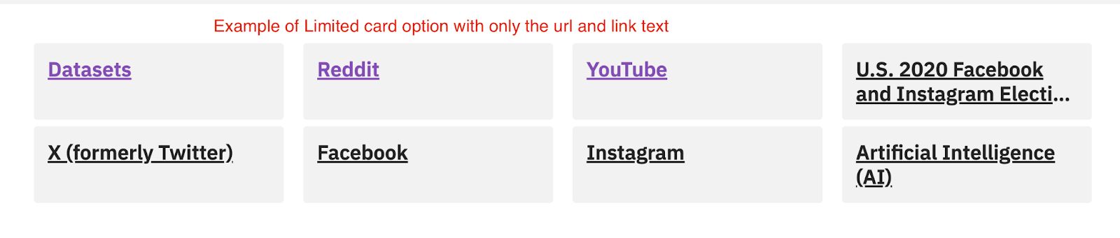
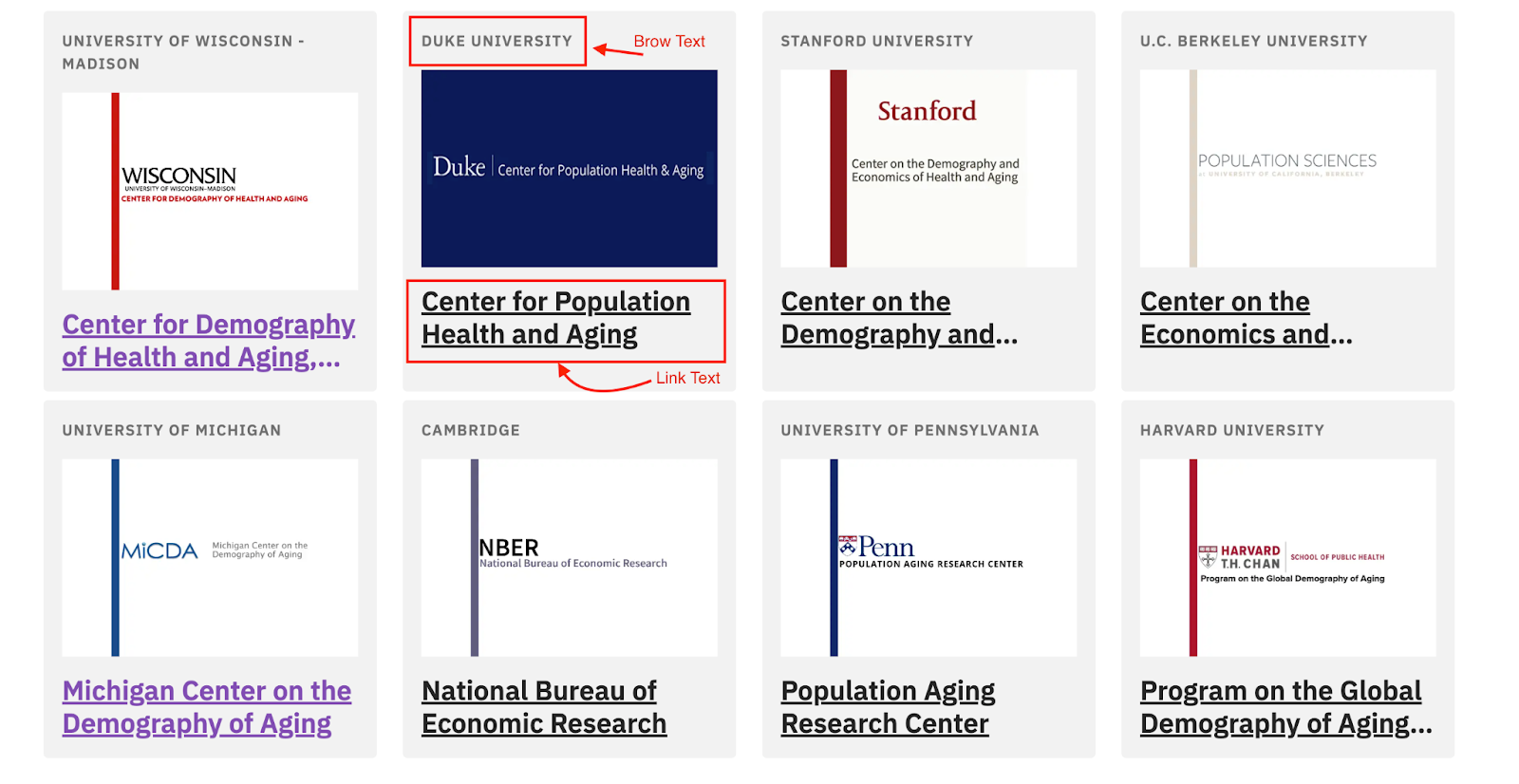
There are also options for adding Brow Text (looks like a badge at the top of the card) and an image. To add an image to the card, the image must be 600×400. See the section on managing site media above for instructions on cropping an image to this size. Examples of limited cards with Brow Text, Image, and Link Text:
—
Q for UXE – is there a display limit on the number of limited cards an editor can place in a single component/row?
The marketing card is an expanded version of a limited card and includes a few more options.
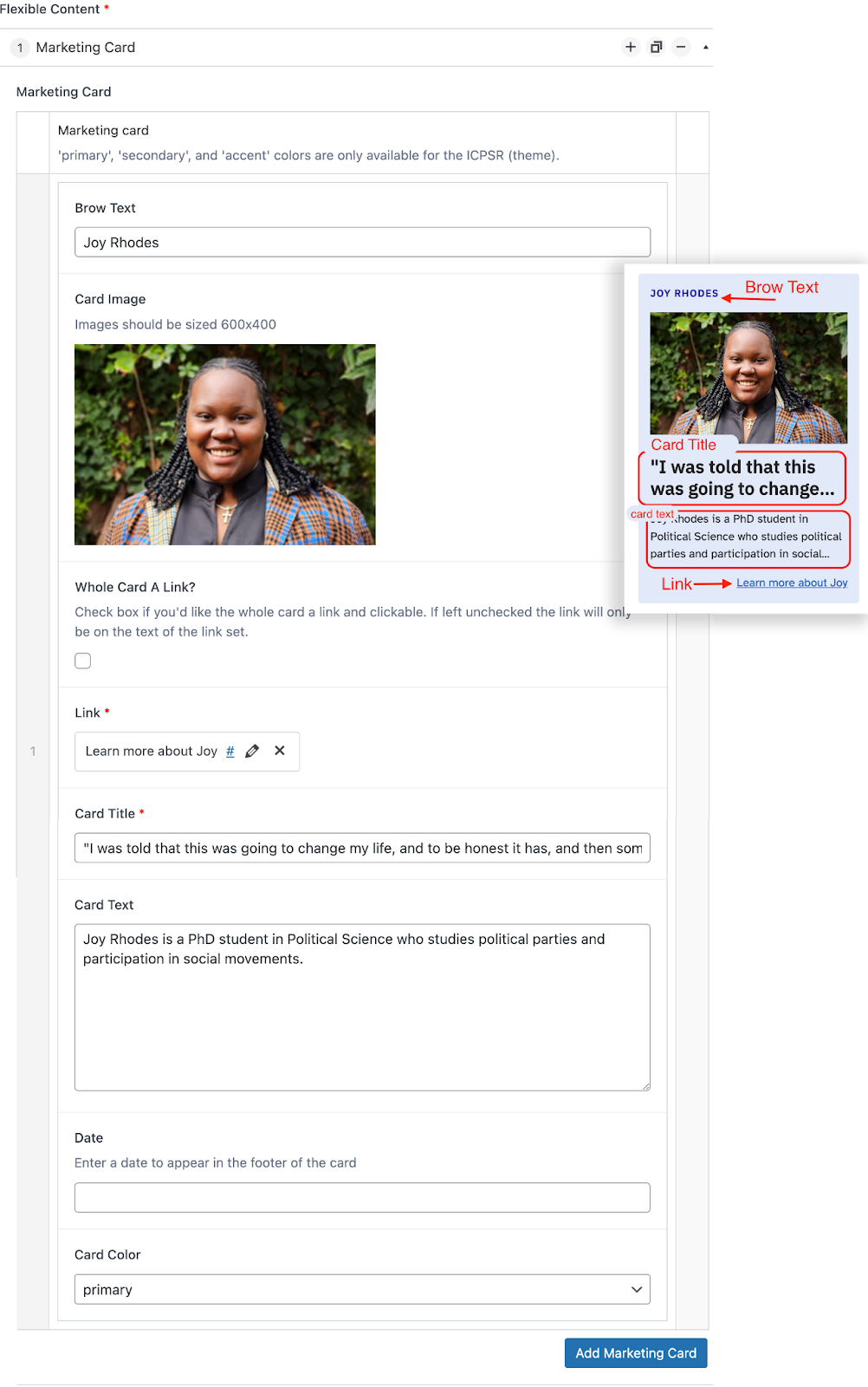 Brow Text (optional) will appear above the image or at the top left of the card.
Image (optional) will appear just under Brow Text (if provided) or at the top of the card. As with limited cards, the image must be 600X400. See the section on managing site media above for instructions on cropping an image to this size.
Whole card a link? Click this box if you’d like the whole card to be clickable. If not selected, only the Link, in the next field, will be clickable.
Link (required) is the URL you’d like the card to take the user to. Also add descriptive link text by clicking on the pencil/edit icon; please do not use “Click Here” or “Learn More”.
Card Title (required) is the largest text size on the card. It is meant to cut off after two lines.
Card Text (optional) will appear just under the Card Title. This text is meant to cut off after three lines.
Date (optional) will appear inline with the Link at the very bottom of the card (left-aligned).
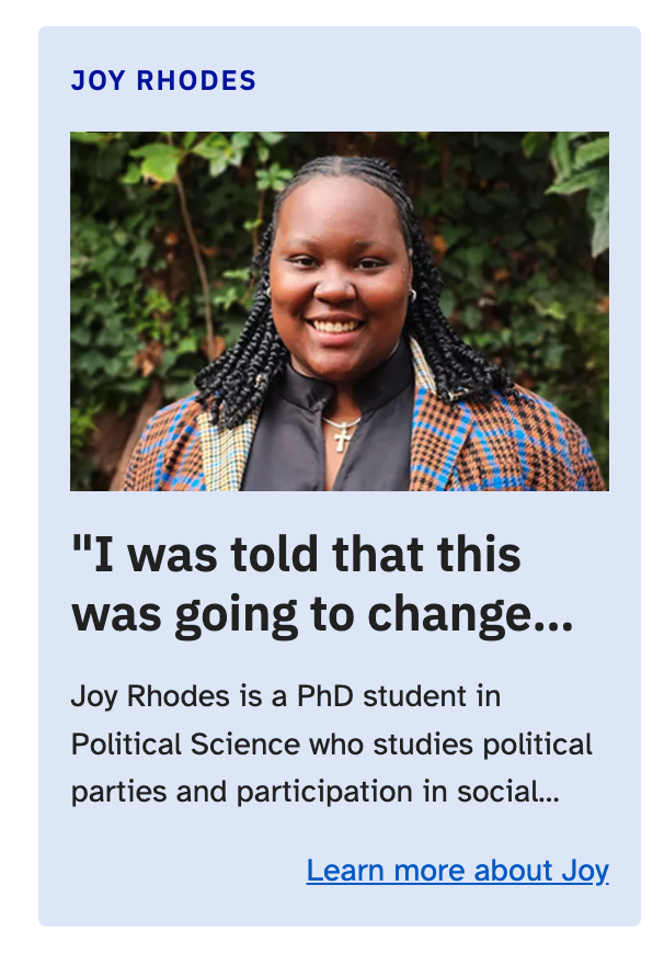
Card Color determines the background color. Unless you are on the ICPSR site, your options are grey and white. If you select primary, secondary, or accent and are on a different project site, it will render as grey until a future update to set these shades for each archive. Examples below show (1) marketing card with Primary background selected (on ICPSR site) and (2) marketing card with grey background.

—
Q for UXE – is there a display limit on the number of marketing cards an editor can place in a single component/row?
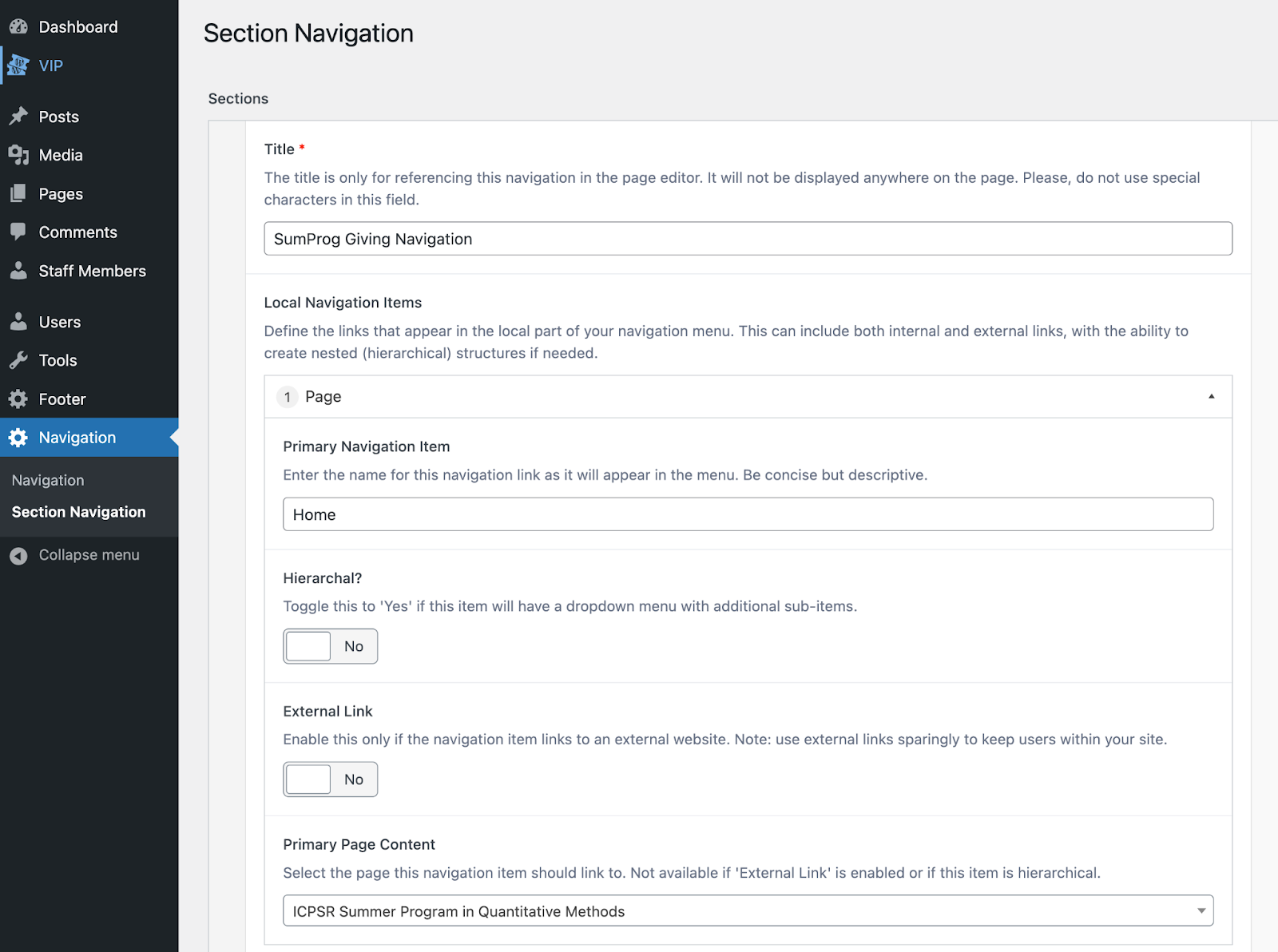
To add left-side navigation to a section of nested parent/children pages, first create all individual pages nested according to the instructions in the “Create/Edit Page” section above. Then you need to define the navigation items by clicking on Navigation → Section Navigation located on the left-side of the overall project site navigation (see first screenshot). Add the text to display in the navigation and the URL it should point to. Publish/Update the section navigation settings in the top right of the section navigation edit screen.
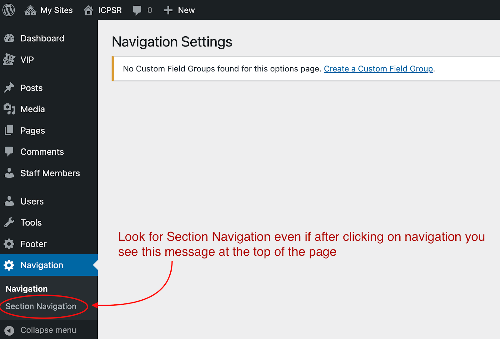
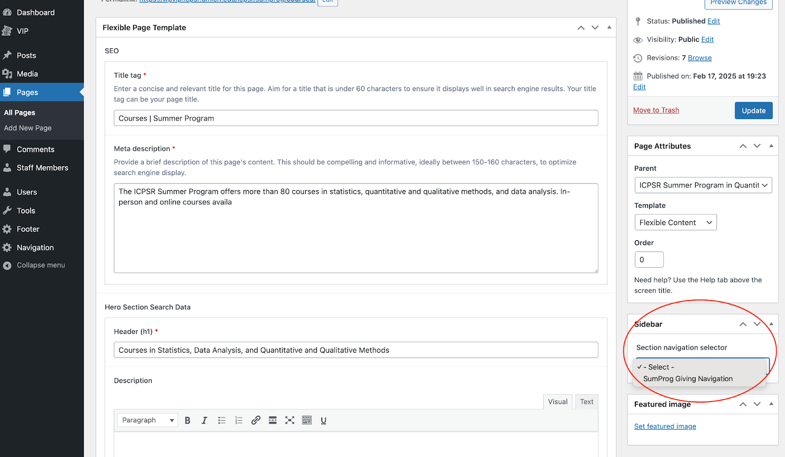
Then navigate back to your list of site pages and edit the pages to which you want to add the section navigation that you just defined. On the right-side of the page edit screen (under the Page Attributes section), find the Sidebar section and select the navigation you just defined from the dropdown. Republish your page to see the changes.
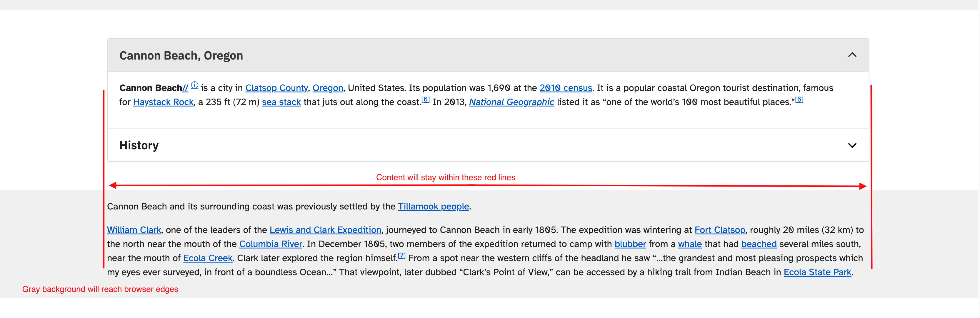
The Section with Background option places a full-width gray background behind the content (like the component being used for the Jump to Links at the top of this page). Editors of the ICPSR site can also select primary- and secondary-tint blue backgrounds. You can currently place a section background behind the following components: Page Content, Accordion, Table, Limited Card, Marketing Card, Button Links, and Highlight Card. The content within the section with background will stay within the max width of the website but the colored background will go from edge to edge in the browser window.
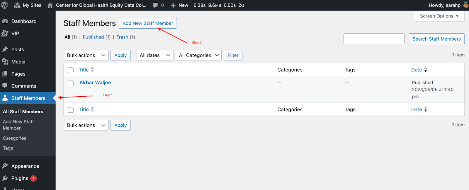 To include a staff section on a page, you first need to add staff to your project by clicking on Staff Members in the left-side site navigation. Then select Add New Staff Member button at the top of the page and fill out as many fields as desired on the Add New Staff Member page.
WordPress does not resize the images. If you want to have a page similar to ICPSR’s People page (where all images are the same) you will need to resize the images either using either the WordPress Resize tool or an outside application like Photoshop before adding pictures to staff profiles.
Click the Publish button. This adds the staff member to your site information but will not make it visible to anyone.
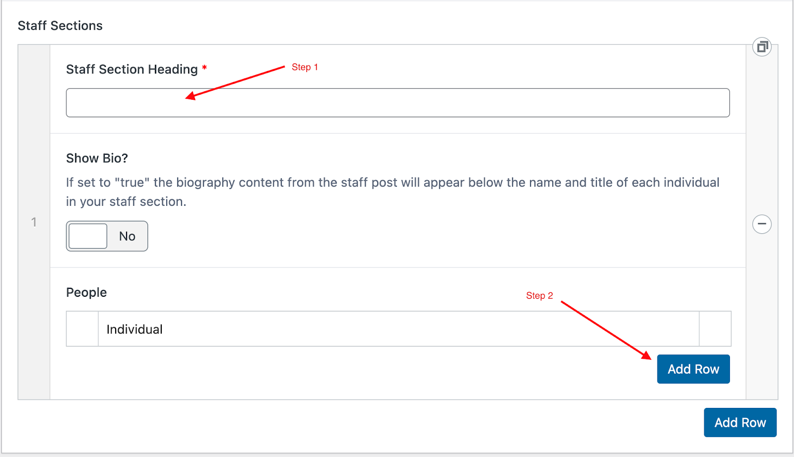 Once you’ve added in the staff members you want to display on the site, you’re ready to add the staff component to the specific page where you want them to display. On the page edit screen, click on Add Row, then select Staff Section. Give your staff section a title in the Staff Section Heading field (e.g., “Staff” or “Project Team”).
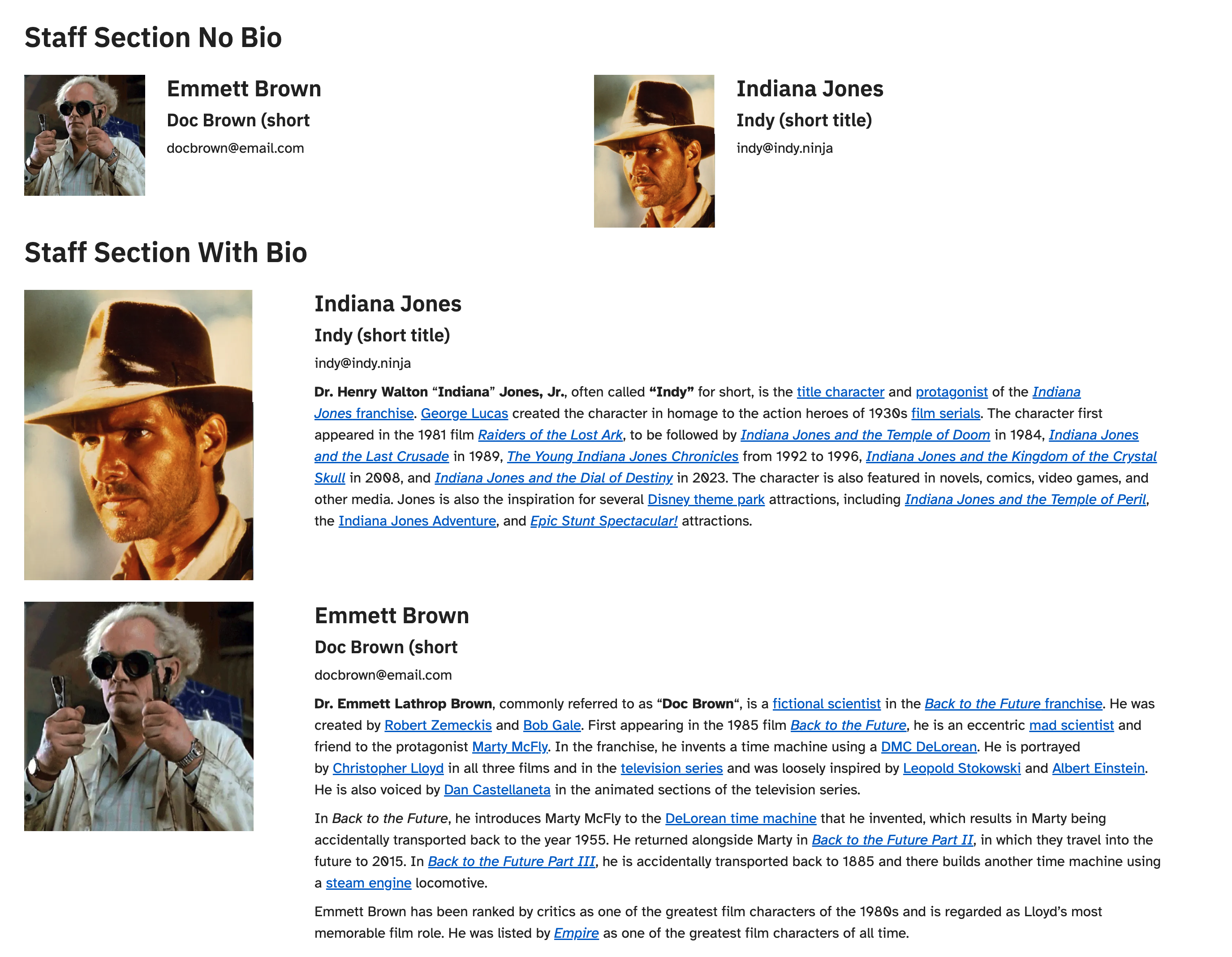
Toggle Show Bio button to Yes if you’d like to display the Bio field next to each staff listed. Please note that if the Bio field is displayed, the amount of content in each bio will affect the space that staff member’s information occupies on the page. For a more uniform appearance, try to keep all bios approximately the same length in addition to ensuring the images are consistently sized. Example staff sections with and without the Bio field are below.
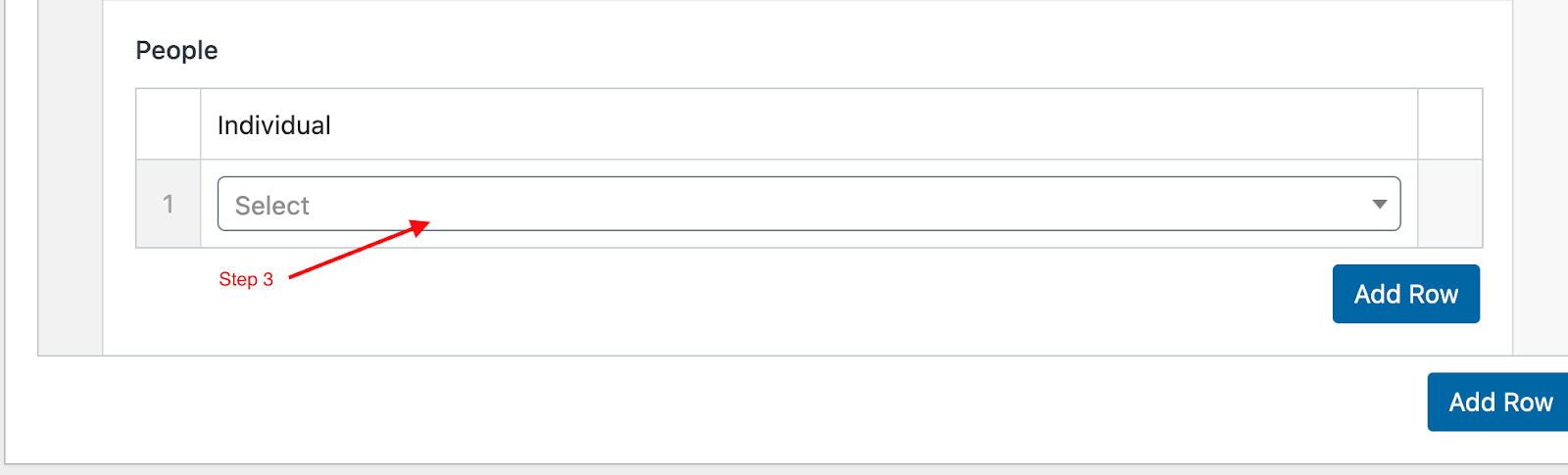
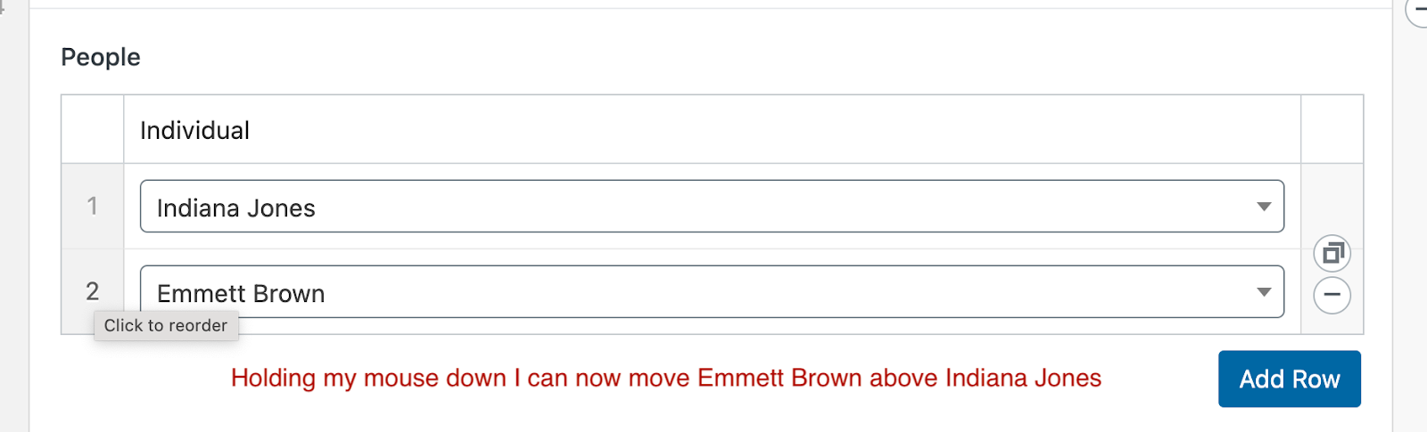
Now within the staff section component, click on the new Add Row button, one for each staff member to appear on the page. Select the relevant staff members to display from the dropdown menu. Reorder how staff are displayed by clicking on the order number to the left of the name and dragging it to the desired position.
The content for a staff section dynamically renders on the published page based on the content for the staff section, so if you want this content indexed and findable via site search, please add the text displayed on the page (e.g., staff names, bios, etc) in the Additional Search Text field at the bottom of the flexible template. See more information about searchable text in the first accordion above.
—
Updates to Staff Component UI upcoming to fit a wider variety of user needs/use cases (expected Fall 2025); update screenshots once complete.
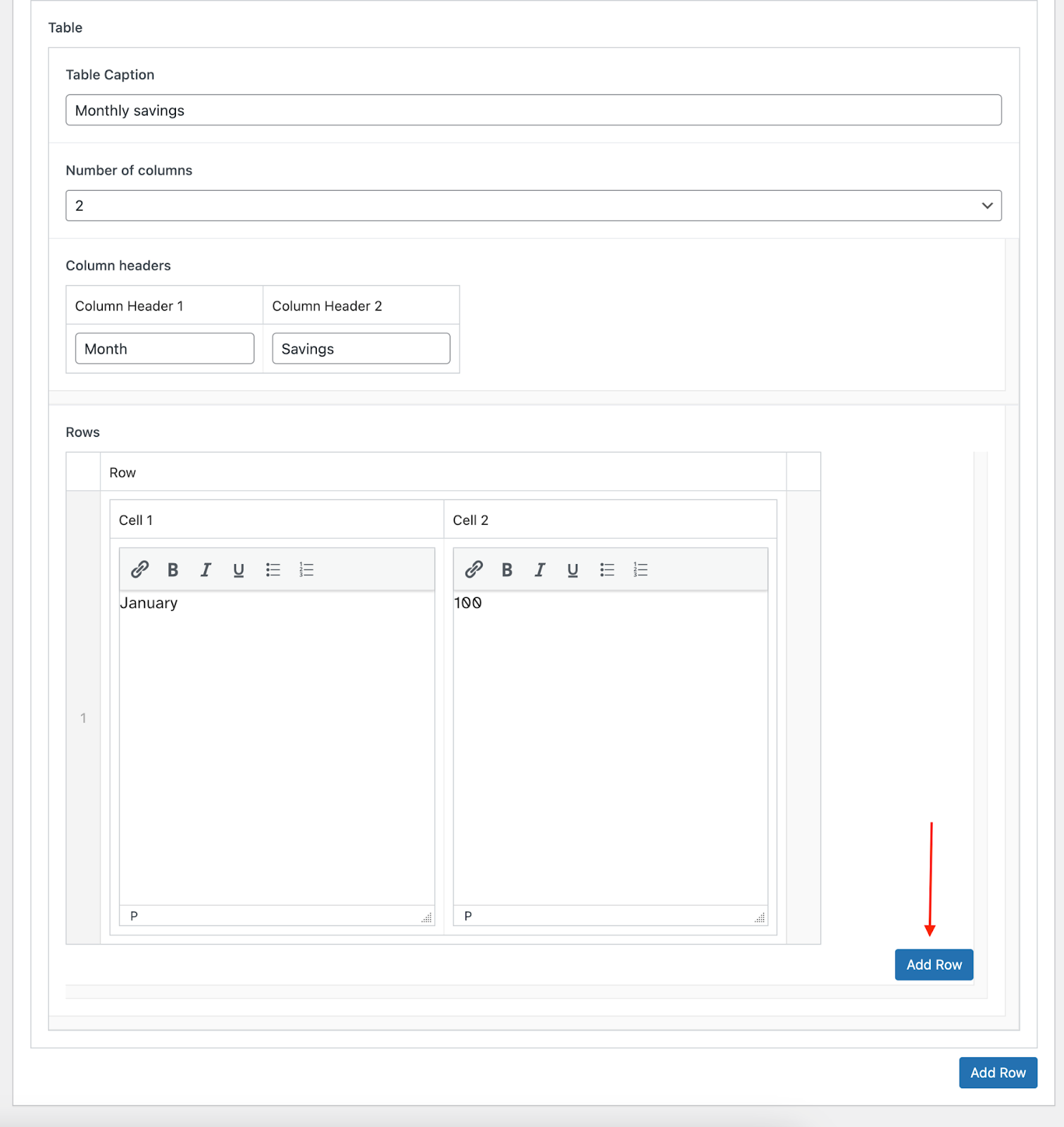
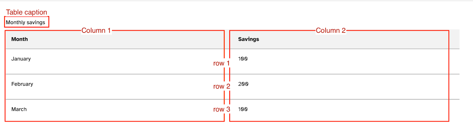
From the Add Row button, select Table. The Table Caption field will appear directly above the table and should consist of a short description of the information the table is providing. Update the Number of Columns based on the data to display and give each column a name in the Column Headers field. Add as many rows as necessary by clicking on the Add Row button, but note that the larger the table the longer the page will take to load.
From the Add Row button, select Two Column Row or Three Column Row from the options. You can currently place the following components in a three-column layout: Page Content, Button Links, Marketing Card, Limited Card, Highlight Card, and Well Group. The same components are available in a two-column layout, as are Accordions, Tables, and News/Events Feeds.
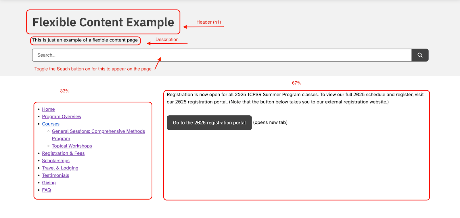
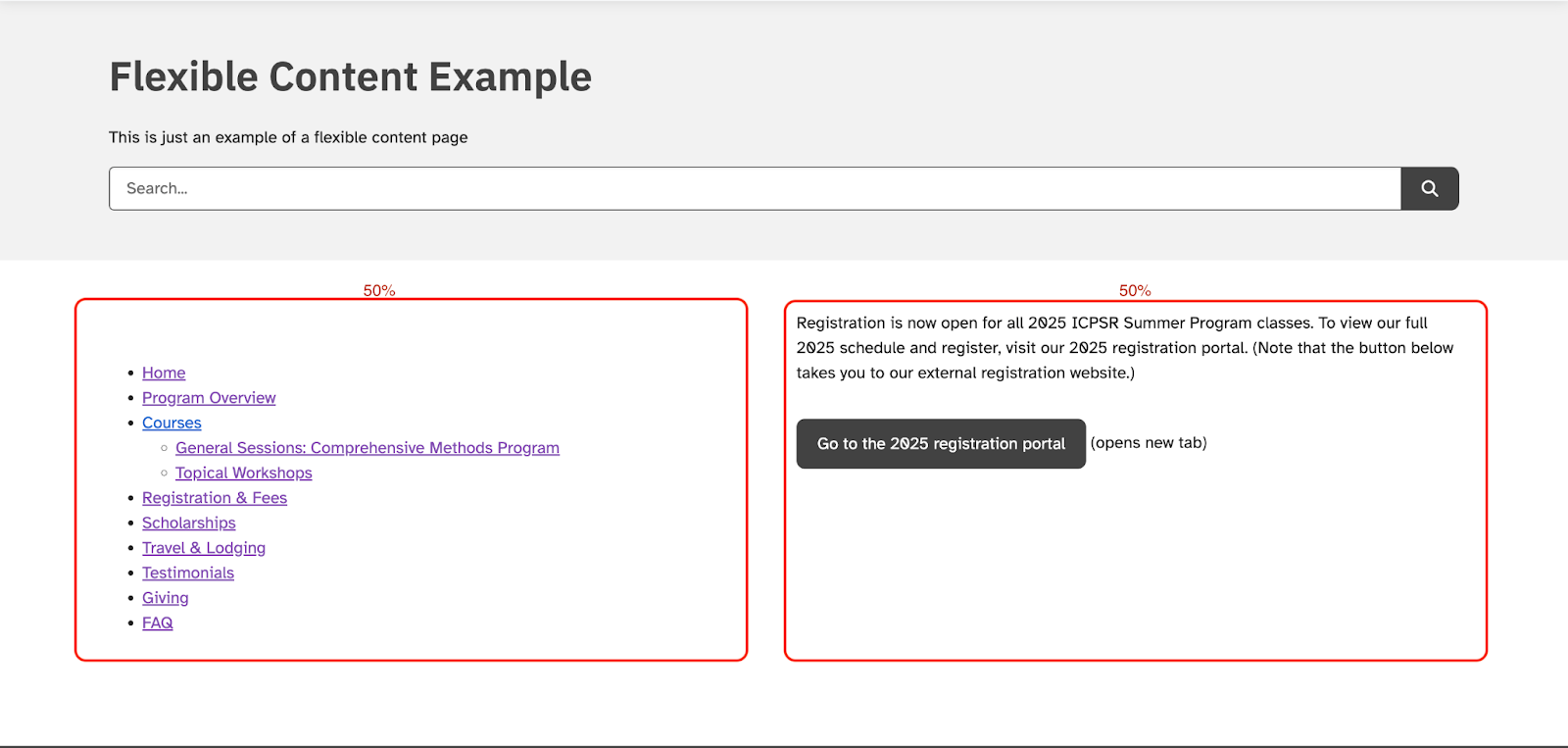
If you select Two Columns, you can choose the relative width of those columns (33/67%, 50/50%, 67/33% where the first number is the width of the left column and the second is the width of the right column). The three-column layout will distribute the three columns evenly across the page (33/33/33%). See examples of different column widths below:
Two-column layout at 33/67% —
Two-column layout at 50/50% —
Two-column layout at 67/33% —
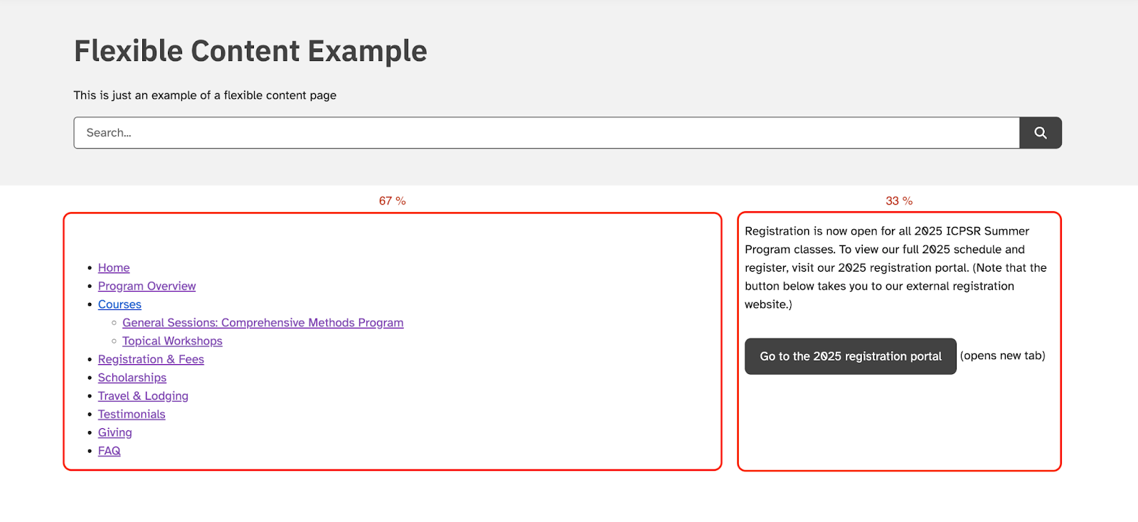
From the Add Row button, select Well Group, which will display a grey box around content. You can currently place the following components within a well group: Page Content, Accordion, Button Links, Marketing Card, Limited Card, and Highlight Card.
Shared Content Project
The Shared Content Project or /shared site is for content that should be shared across sites (like certain News posts) or that is often replicated on many archive/project sites (like FAQs or other Help Resources) so that the content only needs to be added and maintained in one location. This not only prevents spending the additional effort that would otherwise be needed from project and IT staff to add and maintain such content in multiple locations but also helps ensure consistency of information across all of our project sites.
The shared site supports three main post types for shared content: News posts, Events posts, and generic Posts (just “Posts” in the left-side menu). Before adding content to the shared site, please review these policies related to shared site content. Also be sure to search the site before adding content to see if a version of the information you want to add already exists. It is important to keep content streamlined and deduplicated for ease of maintenance, and it’s also important for user-facing groups like M&C and PuMUS to have a centralized place for and be aware of any content updates so they can pass along the most up-to-date info to the social science data community.
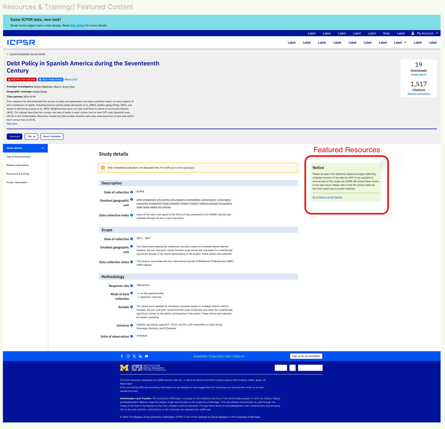
The shared site is also where project staff can configure their site by adding Featured Resources to study pages, uploading their Funder Logos, and/or adding a Site Banner message to all or a select number of sites when necessary. In the accordion below, please find more information about all shared content types; and, click on an image to make it larger.
Please do NOT add Pages to the shared site unless they are intended for internal staff purposes only (like this doc!). This content is not indexed in site search and is not accessible to or discoverable by end users.
All content editors with access to a project site should also likely have access to the shared content site. Check under the dropdown My Sites at the top left of any WP screen to ensure you have access; if you don’t see it, please send an access request to [email protected].
To add a News post, first, navigate to News on the left-side navigation. Similar to adding a new page, click the Add New News button at the top, which will bring up an edit post screen where you can start to fill in the fields. Give the news post a Title or Heading and enter a Meta description as you would when creating a page. Consider optimizing the Permalink/Page Slug to be shorter than the full title of the post for improved accessibility.
Fill in the Page Content WYSIWYG with the content of the news post. You can leave the Node ID field blank. The post’s author will display as the owner of the page by default; toggle the Show Author Name button to No if you’d rather display “By ICPSR Staff” instead of a specific staff member’s name.
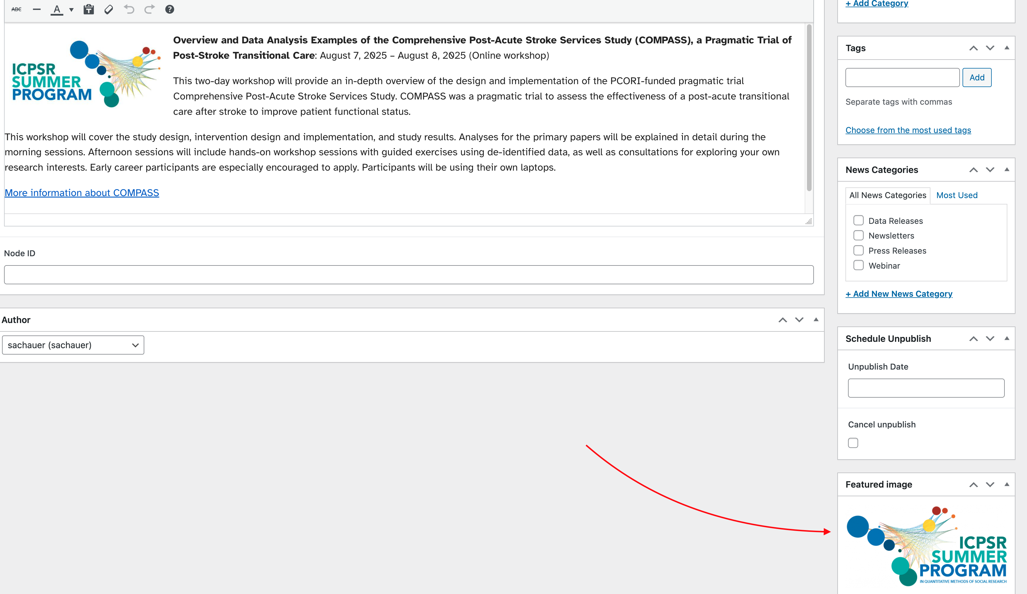
You can add a Featured Image to your news post by finding the relevant section/box on the right-side of the edit screen; the image you select will be the thumbnail that appears alongside the news post on an index/search results page. A square image will work best for the thumbnail display in particular. If you want the image to part of the content you will need to add it using the Add Media button at the top of the content area. You can add it at the top, bottom or within the content.
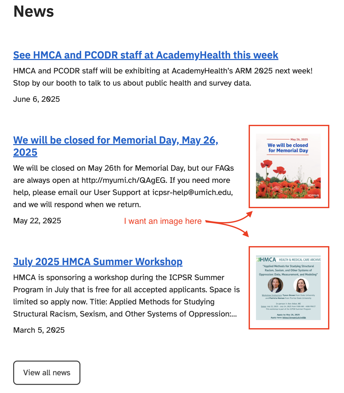
Next, find the box on the right-side of the edit screen called Archives and select the sites on which you’d like this news post to appear. All projects are encouraged to cross-post their news to the ICPSR site or select which ICPSR news posts they’d like to display on their site for increased visibility (as long as this is compliant with their funder rules and regulations)—simply click both your archive box in addition to “ICPSR” in order for the post to show up on both (or several) sites.
For the News Categories box select Data Release, ICPSR Bulletin, or Newsletter if appropriate; otherwise, select Announcement. All posts should be categorized as one (and ideally only one) of these four options. These categories drive site search behavior and allow for filtering on index/search results pages. In addition to either Bulletin, Data Release, Newsletter, or other Announcement, select “Membership News”, “RDE News”, or “Summer Program Event” for posts to appear in those sections of the ICPSR site; note that ICPSR must also be selected as the archive category. News categories are added to posts as badges in feeds and on search results pages. Note that an Upcoming Webinar should be an Event Post (see next accordion item), NOT a News Post.
Selections in the Tags box are currently internal-only (i.e., not user-facing). Tag accordingly if Dory needs to see the post for the ICPSR Bulletin or Annual Reports.
Lastly, scroll back up to the top right to click Publish/Update for your edits to appear on the live site. (See section below for info on scheduling publish and unpublish dates for all post types.)
Where are news posts displayed?
News posts can appear in several places depending on the archives/projects selected and how the posts are categorized.
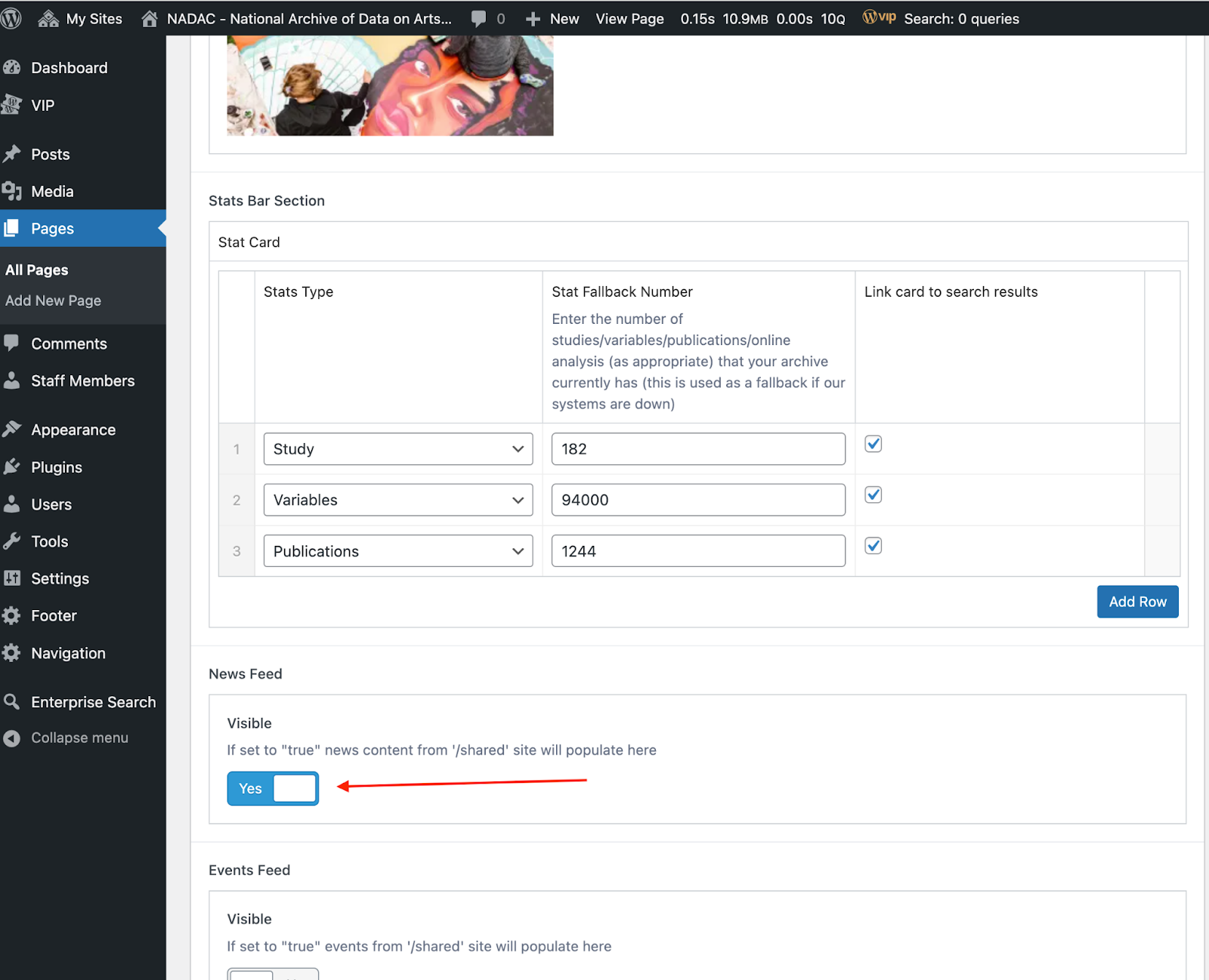
First, there is an option for projects to turn on News for display on their Home page. To do this, make sure you are working in your project site (rather than the shared site). From the All Pages list, select the project home page to edit. Find the News Feed Section and toggle it on for a feed display of all project news to appear on your home page.
Editors can also add a News Feed component to a page using the Flexible Content Template (see above), either for all archive/project news posts or filtered by a specific news category. For example, news posts that are categorized as Membership, RDE, or Summer Program News will display as filtered results in the feed components on these respective pages on the ICPSR site.
News posts are also indexed for display on the search top results page, and the project’s News index page includes filters for News Category and Year. (The example link is the News index page for the ICPSR Archive category; for the link to your project’s News index page, simply replace the “icpsr” part of the URL with your project.) To link to a specific News post once published, use the URL pattern: “www.icpsr.umich.edu/sites/{project}/news/{slug}“.
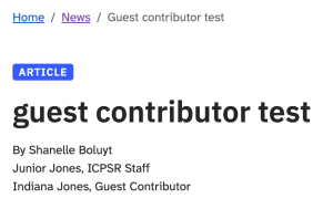
As of June 2026, News posts include an option to add contributors.
How to Add a Contributor
- In the News post editor, find the Show Author Name option.
- Check the box labeled Add Contributor.
- A new contributor section will appear.
- Click Add Contributor in the right corner.
- Enter the contributor’s name.
- Use the dropdown to select one of the following:
- ICPSR Staff — for contributors who are part of ICPSR
- Guest Contributor — for contributors outside of ICPSR
The contributor’s name will appear below the original author’s name on the News post.
To add an Events post, first, navigate to Events on the left-side navigation. Similar to adding a new page, click the Add New Event button at the top, which will bring up an edit post screen where you can start to fill in the fields. Give the event post a Title or Heading and enter a Meta description as you would when creating a page. Consider optimizing the Permalink/Page Slug to be shorter than the full title of the post for improved accessibility.
Next enter in the event Start Date and End Date fields, including start and end times. (Note that there is a UI display fix in progress for events that start and end on the same day.) Then fill in the Page Content WYSIWYG with the content of the event post. Add an Attachment if you have more information about the event that you’d like to distribute.
You can add a Featured Image to your event post by finding the relevant section/box on the right-side of the edit screen; the image you select will be the thumbnail that appears alongside the event post on an index/search results page and will also be automatically added to the top of the page content. A square image will work best for the thumbnail display in particular.
—
Q for UXE – why is there a separate Photos field in the event post template? how is it different from the Featured Image? where do the images entered here display?
—
Next, find the box on the right-side of the edit screen called Archives and select the sites on which you’d like this event post to appear. All projects are encouraged to cross-post their events to the ICPSR site or select which ICPSR events posts they’d like to display on their site for increased visibility (as long as this is compliant with their funder rules and regulations)—simply click both your archive box in addition to “ICPSR” in order for the post to show up on both (or several) sites.
For the Events Categories box select Conference or Upcoming Webinar; otherwise, select ICPSR Event. All posts should be categorized as one (and ideally only one) of these three options. These categories drive site search behavior and allow for filtering on index/search results pages. In addition to Conference, Upcoming Webinar, or ICPSR Event, select “Membership Event” or “Summer Program Event” for posts to appear in those sections of the ICPSR site; note that ICPSR must also be selected as the archive category. Event categories are added to posts as badges in feeds and on search results pages.
Selections in the Tags box are currently internal-only (i.e., not user-facing). Tag accordingly if Dory needs to see the post for the ICPSR Bulletin or Annual Reports.
Lastly, scroll back up to the top right to click Publish/Update for your edits to appear on the live site. (See section below for info on scheduling publish and unpublish dates for all post types.)
Where are event posts displayed?
Event posts can appear in several places depending on the archives/projects selected and how the posts are categorized.
As with News, there is an option for projects to turn on Events for display on their Home page. To do this, make sure you are working in your project site (rather than the shared site). From the All Pages list, select the project home page to edit. Find the Events Feed Section and toggle it on for a feed display of all project events to appear on your home page.
Editors can also add an Event Feed component to a page using the Flexible Content Template (see above), either for all archive/project events or filtered by a specific event category.
Event posts are indexed for display on the site search top results page, and the project’s Events index page includes filters by Event Category. (The example link is the Events index page for the ICPSR Archive category; for the link to your project’s Events index page, simply replace the “icpsr” part of the URL with your project.) To link to a specific Event post once published, use the URL pattern: “www.icpsr.umich.edu/sites/{project}/events/{slug}“.
—
Updates to Event post UI upcoming to improve “above the fold” display and remove the auto-add of the featured image to the post so that image is only used for index page thumbnails (expected late 2025/early 2026); post updated screenshots once complete.
To add a generic Post, first navigate to Posts on the left-side navigation. Similar to adding a new page, click the Add New Post button at the top, which will bring up an edit post screen where you can start to fill in the fields. In contrast to the pre-populated news and event post templates, you will need to find the Post Attributes box on the right-side of the screen and select the Flexible Content Template from the dropdown in order for the template fields to appear on the screen. From here you can create or edit a post exactly as you would a project site page using the Flexible Content Template (see section above).
Before publishing, find the box on the right-side of the edit screen called Archives and select the sites on which you’d like this post to appear. All projects are encouraged to cross-post to the ICPSR site (or vice versa) for increased visibility (as long as this is compliant with their funder rules and regulations)—simply click both your archive box in addition to “ICPSR” in order for the post to show up on both sites.
Next, scroll down a little further to the Generic Categories box to categorize the post. As with news and events, the post categories drive site search behavior and allow for filtering on index/search results pages; however, in contrast to these other post types, generic post type categories are nested in order to consolidate content for display on the site search top results page. The main parent categories “Help Resources” and “Knowledge Center” each contain several different generic post subcategories that are consolidated for this search display. Once a user clicks on “View more help resources” or “View more knowledge center resources” from the top results page, the nested subcategories then drive additional filtering functionality. When you select a child category for a generic post, you must also select all of its parent categories for the post to be indexed and displayed on search results pages and discoverable via filters. Generic post categories and subcategories are also added to posts as badges in feeds and on search results pages.
For posts categorized as Help Resources, subcategories include “ICPSR Documentation” for content like “How to Log In” or other information about ICPSR and its systems/processes more broadly and “FAQs”, with many more subcategories to reflect the substantive content of the FAQs. For posts categorized as Knowledge Center resources, subcategories include Data Spotlights & Resource Guides, Featured Research (e.g., Research Spotlights, Current Events in the Bib), & Recordings (e.g., Videos & Past Webinars, Blalock Lectures, Data Brunch Podcasts). See the full list of Generic Post Categories in the Posts section of the shared site. Please note that several are archive-/project-specific but they must live in the shared project site in order to cross-post with the ICPSR site. Please be respectful of other editors’ content, and don’t make any changes to pages or posts that are not yours without consulting the relevant project staff and site owners.
Lastly, scroll back up to the top right to click Publish/Update for your edits to appear on the live site.
Where are generic posts displayed?
Posts categorized as Help Resources or Knowledge Center (and their applicable subcategories) are displayed in their respective boxes/sections on the site search top results page or listed on their respective index pages with subcategory filtering available (these example links are for the ICPSR Archive category):
- https://www.icpsr.umich.edu/sites/icpsr/categories/shared/help-resources
- https://www.icpsr.umich.edu/sites/icpsr/categories/shared/knowledge-center
Editors can add a Generic Post Feed component to a page using the Flexible Content Template (see above), either for all posts in a parent category or filtered by a specific generic post sub-category. To link to a specific generic post once published, use the URL pattern: “www.icpsr.umich.edu/sites/{project}/posts/shared/{slug}“.
There are a few ways to leverage ICPSR’s new site search to direct users to specific shared content for each of the three main post types (news, events, and generic posts):
Index/Search Results Pages by Post Type
As noted in the sections above, you can link to your project’s News and Events index pages by changing “icpsr” in the examples below to your project:
Although there is no comparable single index page for generic posts (because of the wide variety of content these posts can be used for), there are index pages for the content combined into the “Help Resources” and “Knowledge Center” parent categories (again, replace “icpsr” with your project site for only those within your Archive category):
- https://www.icpsr.umich.edu/sites/icpsr/categories/shared/help-resources
- https://www.icpsr.umich.edu/sites/icpsr/categories/shared/knowledge-center
Index Pages by Post Type Category
You can also link to specific categories of news, events, and generic posts.
For generic posts, two different links could be used to direct users to the same list of search results by category: (1) a link to the parent category index page with a filter selected, or (2) a link to the child category index page.
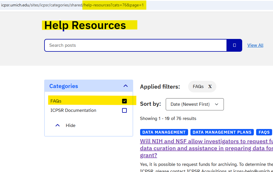
For example, if you want to link to all FAQs, you can navigate to its parent category Help Resources index page (the screenshot with the “Help Resources H1) and then select the FAQs filter. Notice that the URL has changed to “…/sites/icpsr/categories/shared/help-resources?cats=76&page=1” and that the left-side filter displays FAQs and other sibling-level categories.
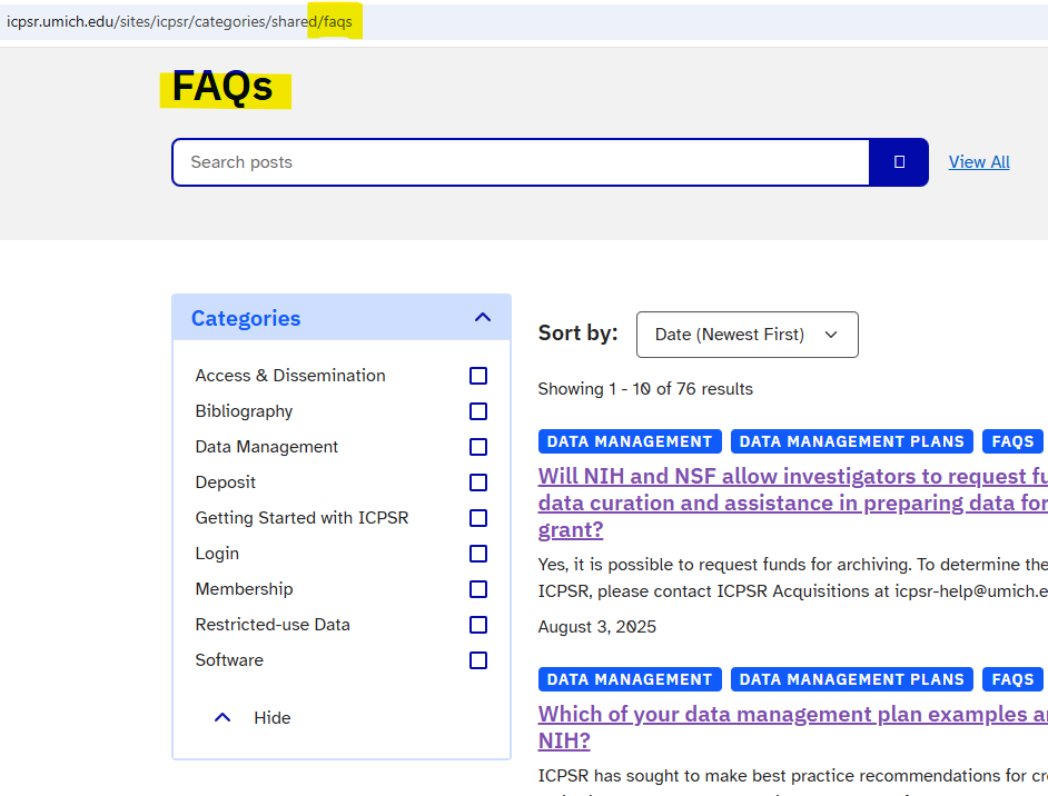
Alternatively, you can navigate directly to the FAQs category index page: https://www.icpsr.umich.edu/sites/icpsr/categories/shared/faqs (the screenshot with the “FAQs H1) to dynamically generate the same list of posts, but with a different Heading and with the left-side filter instead displaying the sub-categories nested under the “FAQs” parent category. If there are no sub-categories, the left-side filter will not appear on the page.
For news and events, there is only one option for generating a link to the post type categories because news and event post types do not have the same nested category structure as generic posts. To get a specific link for a category of news or events, start from the overall News and Events index pages, click on the desired child category, and copy the URL that displays in the browser (e.g., https://www.icpsr.umich.edu/sites/icpsr/news?ncats=7&page=1 will return the list of News posts categorized as “Announcement”).
For all index pages, filter options will not appear in the left-side box for any category that does not have an associated post for the archive/project site in question.
See also: Jenna’s overview of different post types
TO DO – consolidate this info here for all three post types once available for generic posts
—
You can schedule news and events to publish and unpublish on specific days. This will change your post/news/event from Published to Draft. When a post is in Draft it will not appear in the results.
On the left side of the page within the Publish box select the Edit link next to Publish immediately

A calendar and date option opens up and upon hitting Ok the text will change to Schedule for: {date you’ve entered}

To unpublish, further down the left side menu is the Schedule Unpublish section

UX Team to add instructions
UX Team to add instructions
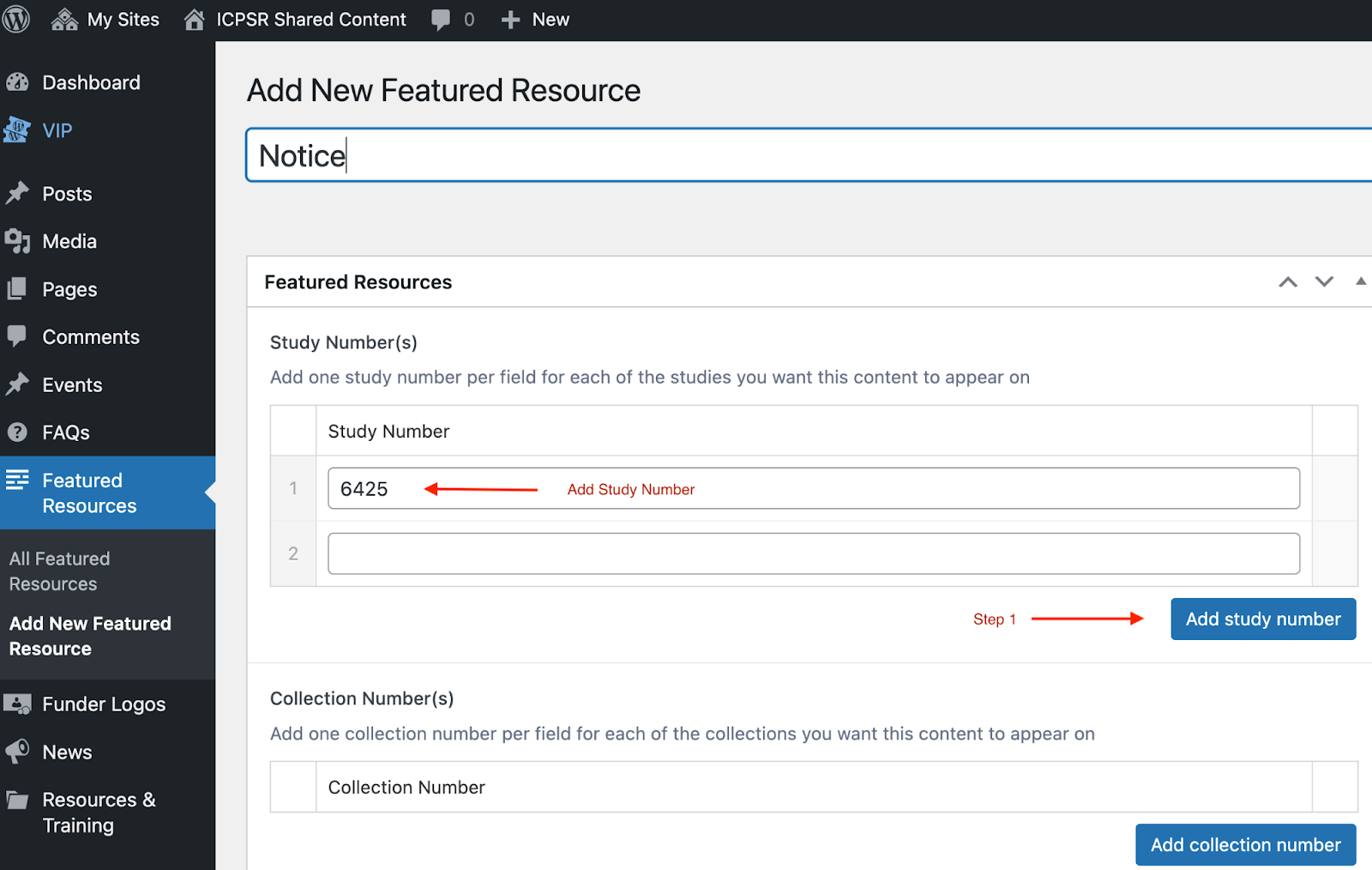
The Featured Resources section of the shared project is the source for the Featured Resources boxes that appear on study pages. First, give the Featured Resource a Title or Heading. Then, to add a Featured Resources box to a specific study page, you need to add the Study Number. If you’d like it to appear on more than one Study Home page you may enter in as many study numbers as you’d like. First click the “add study number” button – this will make the input appear for the first study number you’d like to enter. If you’d like another study number click “add study number” again.
Collection Number is the former Series. Similar to Study numbers hit the “add collection number” button to make the input to appear and then add the collection number.
Recommended Overall Best Practices
UX Team is working on consolidating recommendations… keep checking back as more content is continuously added.
- Do not skip Heading levels. In other words, after the H1, if you want subsections of content on your page, you must add one or more H2s before you can add an H3; you should not skip directly from an H1 to an H3 or H4 for improved accessibility, even if you prefer the way the smaller headings appear on the page.
- It is strongly recommended that you refrain from adding your own HTML to pages. There are several reasons for this: most importantly, it will likely disrupt the design system and compromise accessibility. Additionally, your custom HTML may not be updated when technology evolves.
- If you have multiple sections or subsections of WYSIWYG content back-to-back on a page, it’s recommended to consolidate them all into one Page Content component as much as possible for improved page load times; i.e., do not create a new WYSIWYG row for each section of content unless there are other layout components in between.
- If you notice spacing or other design issues in between sections of content in a single WYSIWYG or in between layout components, please email [email protected] so the UXE team can make a holistic fix rather than trying to hack a certain layout for a specific page.
- Limit the amount of center-aligned text for improved accessibility.
General Troubleshooting
You just created a page and published – how the heck do you find it, especially since that permalink/slug takes you to a blank page.
Use the first part of your production URL, e.g.:
- https://www.icpsr.umich.edu/sites/icpsr/
- https://www.icpsr.umich.edu/sites/hmca/
- https://www.icpsr.umich.edu/sites/somar/
Then add just the slug/permalink, e.g., the bold part of: https://wpvip.icpsr.umich.edu/icpsr/manage-data/
Shared content works similarly but each post type has a different URL pattern (see top of page).
If you are looking for News, Events, FAQ’s it is possible you are not under the ICPSR Shared Content.
Look towards the top part of the WordPress site near My Sites you are looking for it to say ICPSR Shared content.

Or vise versa you aren’t seeing any of your websites pages – make sure it says your archive.

First, check to make sure you have the correct URL pattern and slug; then, check to make sure there are no empty content rows. If problem persists, please email [email protected].
Check to make sure the slug is not in use, not only in published pages, but also in the Drafts and Trash lists.
The preview button has a custom url with a secret that bypasses the Next.js application cache (you can view the link by clicking “copy link” on the preview button). Usually, when a page is visited a cached version of the page is delivered to users so that our pages load fast and we don’t create an unnecessary burden on our database.
When previewing newly published content make sure you are viewing the page by clicking the preview button every time. To avoid confusion close other versions, instances, or tabs of the same page you may have open in your browser.
This happens when your login session expires while you’re editing a page. If you saw a “please log in again” prompt and then kept editing without refreshing the page, your save will fail with this error.
How to avoid it:
If you ever get prompted to log in again while editing, don’t just log back in and keep typing. Copy your changes somewhere safe first, then fully refresh the page before continuing. Logging back in without refreshing leaves the page holding an expired security token, so the save will fail and you’ll lose your edits. To be extra safe you should log out of WordPress regularly and close unused WordPress editor tabs when they are not in use.